Design UI Page#
 UIPage.Design
UIPage.Save
Overview#
To have a fully functioning UI Page follow the steps below.
Sequence of Steps#
-
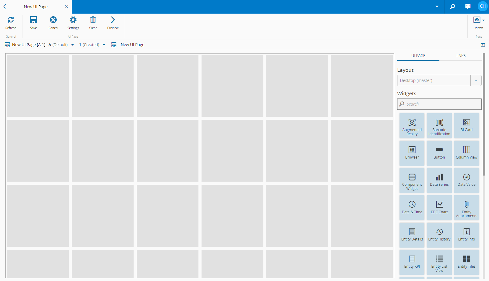
To access the Design View, select Edit on the top ribbon.
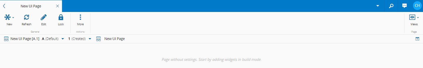
-
Populate the page by dragging and dropping the widgets on the right into the desired areas.
-
Select Preview on the top ribbon to see your UI Page. And Back to Editor to continue editing.
- When you are satisfied with the layout, select Save on the top ribbon.
- To return to the Preview, select Edit on the top ribbon.
Warning
If a UI Page is set as the homepage, opening a link to another UI Page will open it in a new tab. If not, the new UI Page will open it in the same tab, replacing the current one.
Page Builder Settings#
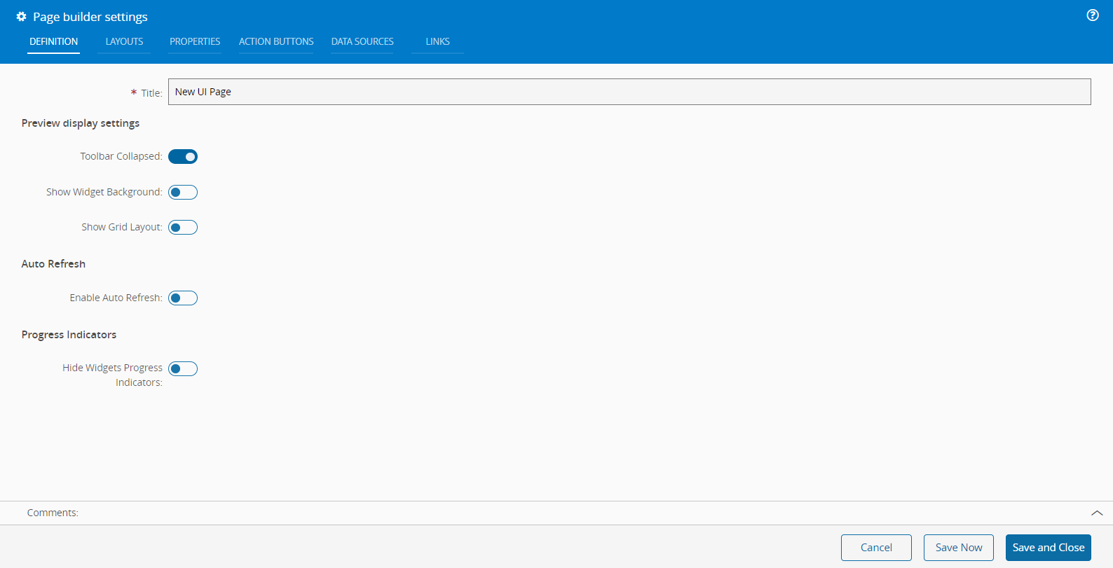
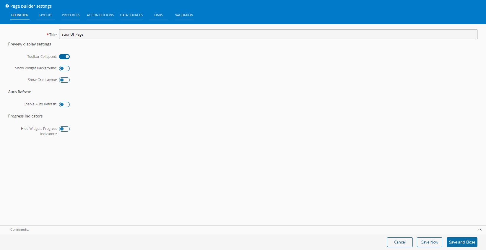
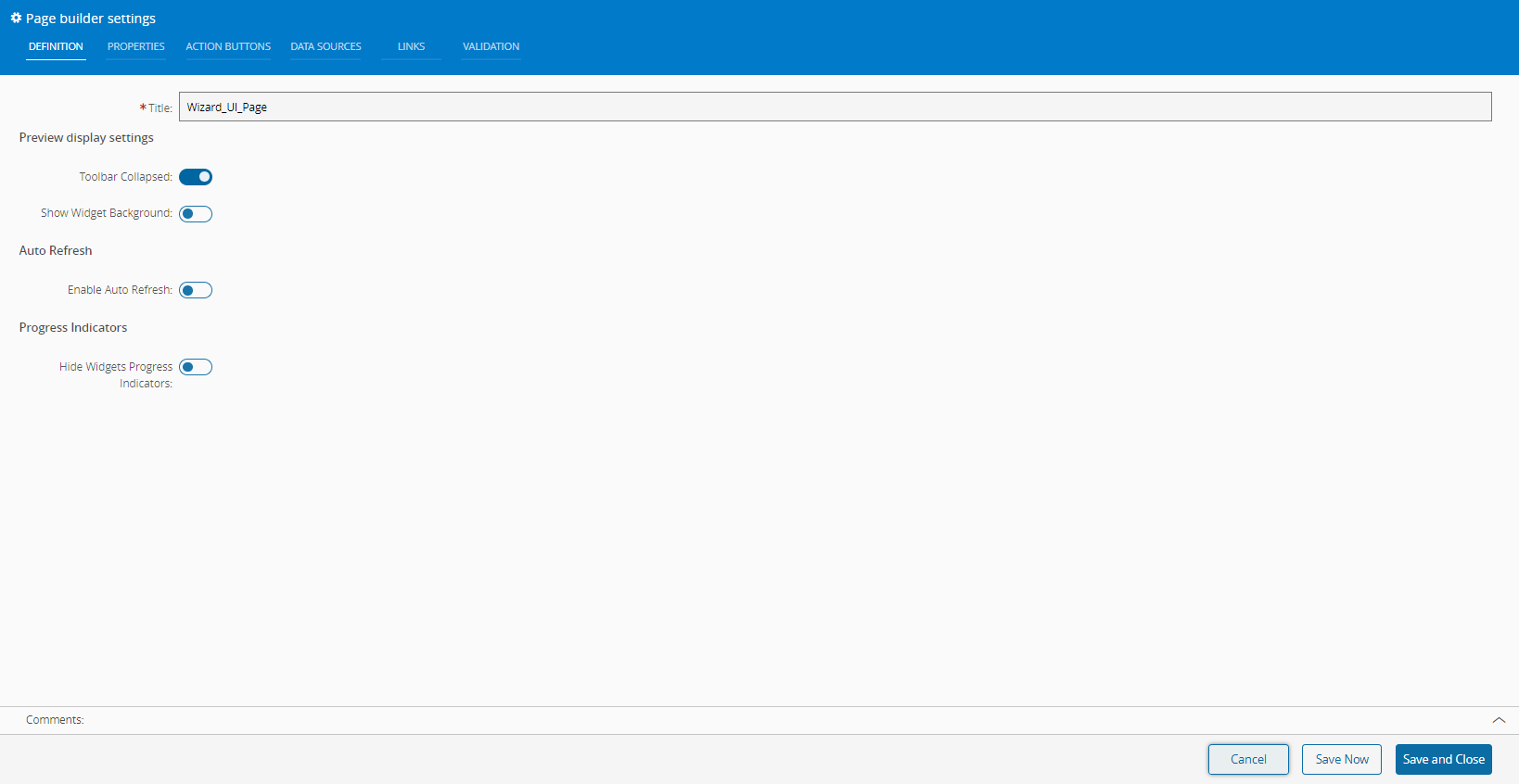
Definition#
In the Definition tab you can set the Title of the page, which defaults to the name of the UI Page. Additionally, you can configure:
Preview display settings
- Toolbar Collapsed - expand or collapse the UI Page action bar.
- Show Widgets Background - show or hide the background of all the widgets on the UI Page.
- Show Grid Layout - display or hide the grid.
Auto Refresh
- Enable Auto Refresh - enable or disable automatic page refresh.
Progress Indicators
- Hide Widgets Progress Indicators - display or hide progress indicators for widgets.
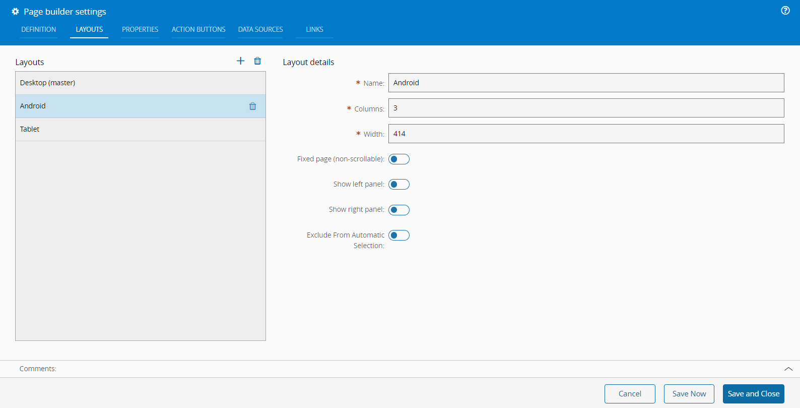
Layouts#
The Layouts tab is a crucial feature for managing the various layouts used within the system. This tab not only displays the existing layouts but also provides options to add or delete layouts using the and icons, respectively.
To add a new layout you need to provide a name and set the number of columns and width of the page. The system uses this width to determine the most appropriate layout for displaying content on different devices.
The layout configuration also includes several additional options that you can enable or disable according to your needs:
-
Fixed page (non-scrollable) - the content will fit within the viewport without requiring scrolling.
-
Show left panel/Show right panel - this option toggles the visibility of a left panel, which can be used for navigation or additional content.
-
Exclude From Automatic Selection - prevents the layout from being automatically selected by the system based on the viewport size.
Note
You can create as many layouts as needed to accommodate different sized devices, ensuring optimal display and functionality across various screen sizes. For more information, see Viewport Size for Devices ⧉.
Properties#
Properties are used to share information among page elements.
Similar to the previously described tab, the properties tab can be used to maintain page properties by adding () or removing () them.
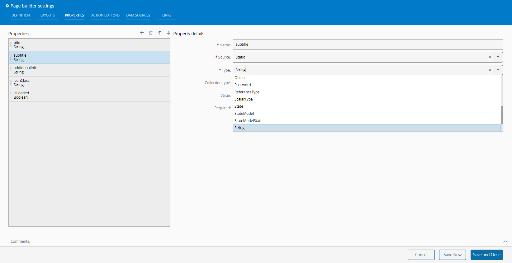
The properties must have a Name and Source.
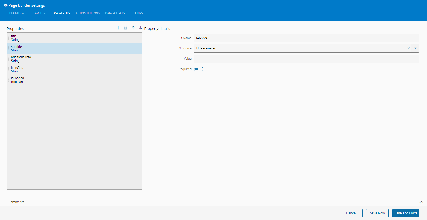
The Source can be Static or URLParameter.
If the Source is Static, you must define a Type from the available options:
If the Source is URLParameter, you, optionally, need to define a Value and enable or disable the Required flag, which defines if the property is mandatory or not.
Action Buttons#
The Action Buttons tab has extra buttons that can be managed in this tab.
It is also possible to change the display order of the buttons by using the and arrows.
To a new button to the page you only need to define the Name. Optionally, you can provide the Description and Alignment (Left/Right). Also, available are the Dropdown, Hide, and Disable options as well as the Action Group setting.

To assign actions to newly created buttons, follow the steps described in the Button section.
Data Sources#
Data Sources provide a convenient way of loading data within the UI Page.
This data can be used within a link as a way of providing information needed to the available widgets.
The defined Data Sources are listed in this tab and can be managed (as in previous tabs).
For each Data Source it is mandatory to define a Name and Type.
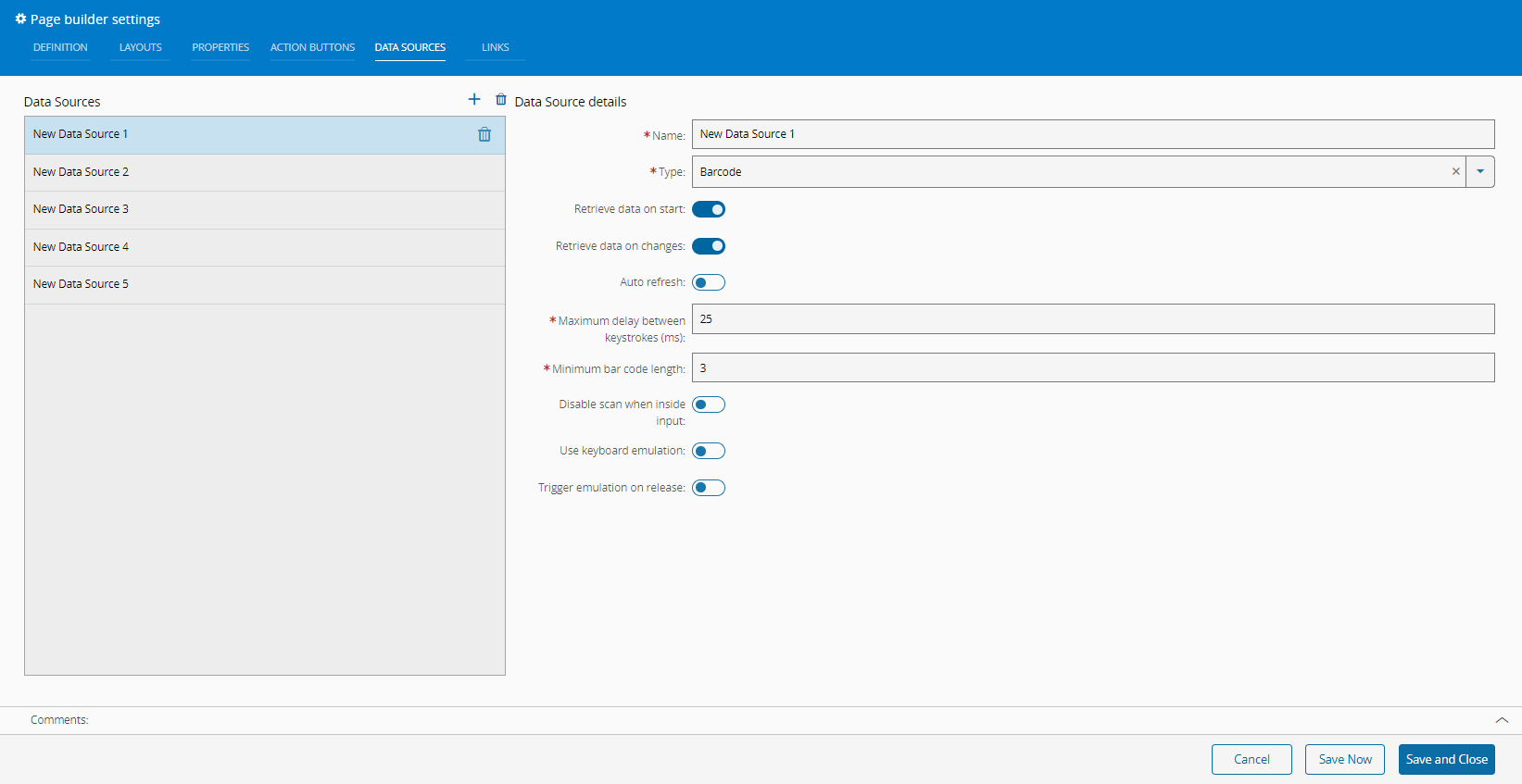
The Type field has many options and some of them have additional mandatory fields as shown in the print above and in the selection of prints below:
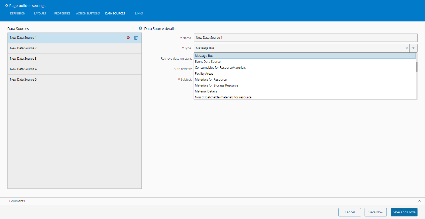
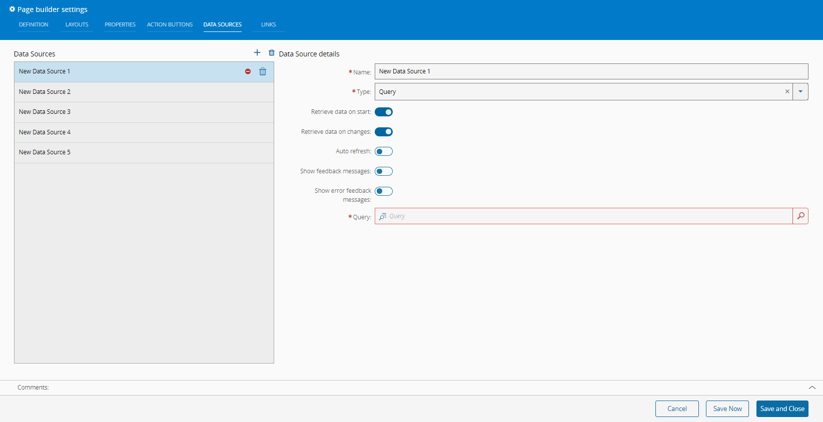
The different types are described in the System Data Sources section.
Depending on the Type you select, be sure to complete all the mandatory information before you Save and Close.
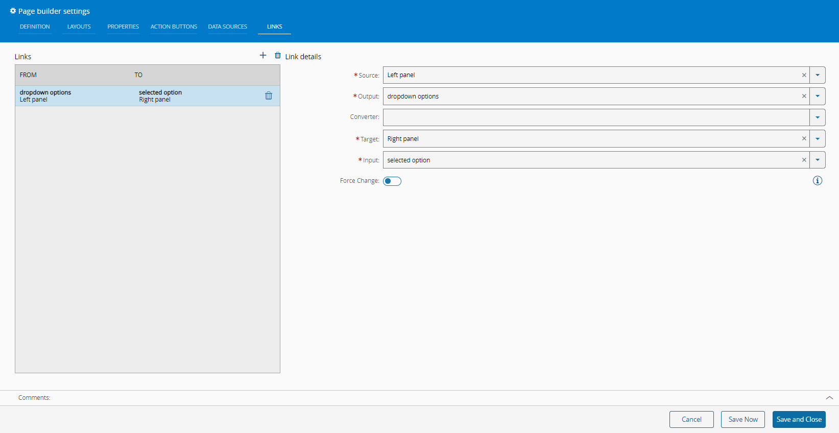
Links#
The Links tab contains the existing links between page elements that are responsible for sharing data among them. They can be managed as in previous tabs.
What follows is an example of the option Page from the Source dropdown:

As can be seen above, it is mandatory to define: Source, Output, Target, and Input. Optionally, a Converter can be defined. The system will guide and select the correct fields that match the previous selections.
What follows is an example of the option Left panel from the Source dropdown:
Creating Steps and Wizards#
The creation of a UI Page of the type Step and Wizard is similar to the creation of a UI Page of type Page, as described in the section Create UI Page.
After creation, the UI Page of the type Step and Wizard will be displayed empty. Enter the Design View by selecting Edit on the top ribbon, followed by Settings.
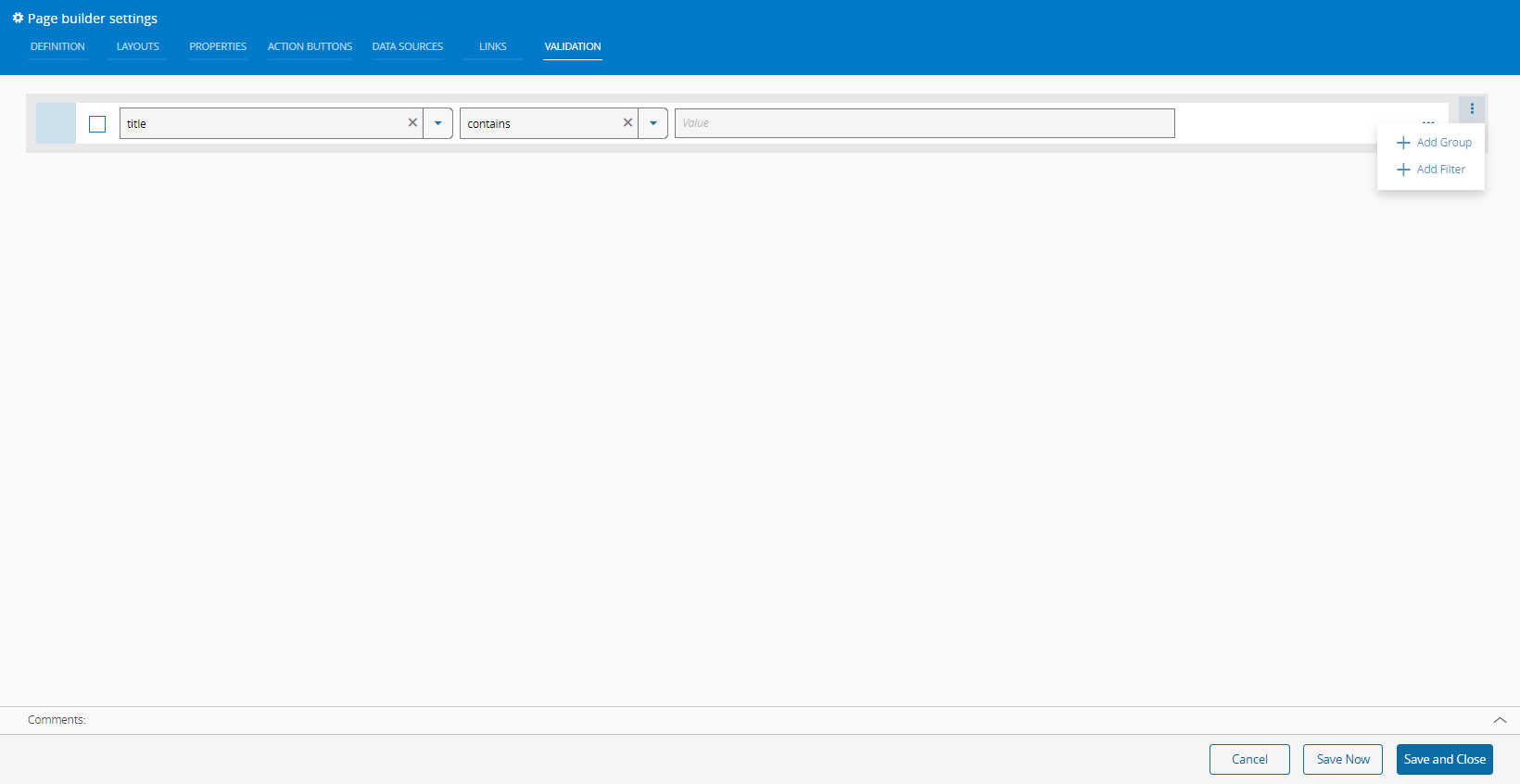
An extra Validation tab will be visible in the Page Builder Settings.
For the UI Page of type Step, the Validation tab allows you to create a Boolean expression that will be used by the system to validate the step:
For the UI Page of type Wizard, there is also a Validation tab but there is no Layout tab as the layouts are managed by the system. The Show Grid Layout property is also managed by the system and cannot be set.
In both cases, UI Pages of type Step and Wizard, you must Save and Close for the Validation to take effect.
Deploying UI Pages#
To deploy UI Pages refer to the section Copying System Configurations of the Operations Guide, which describes how to copy configurations from one system to another.