Button#

Overview#
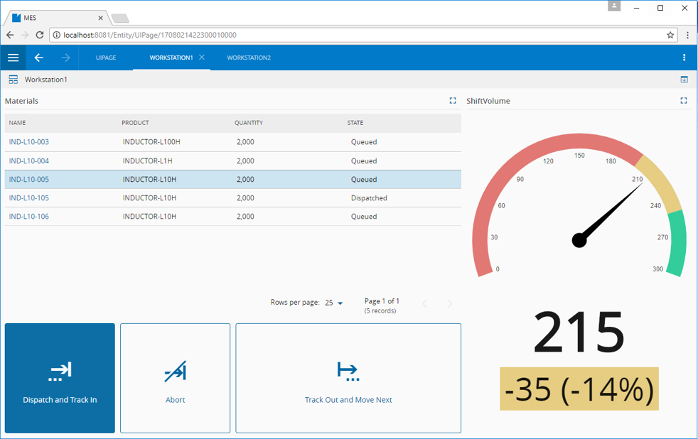
The Button Widget provides a mechanism to execute an action in the system. An example is shown below, where a UI Page possesses three Button Widgets to perform Material operations
To use the Button Widget in an UIPage, follow the steps below.
- In any UIPage in Build mode, select the Button Widget from the Widgets list located in the right side of the page, and drag and drop to the correct place in the UIPage.
- Enter the Settings section of the Widget.
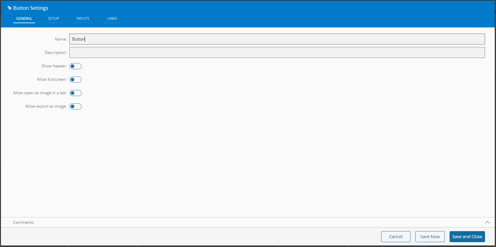
- In the General tab, provide a name for the Widget, a description, and specify whether it should display the header and also if the user can activate the full screen mode.
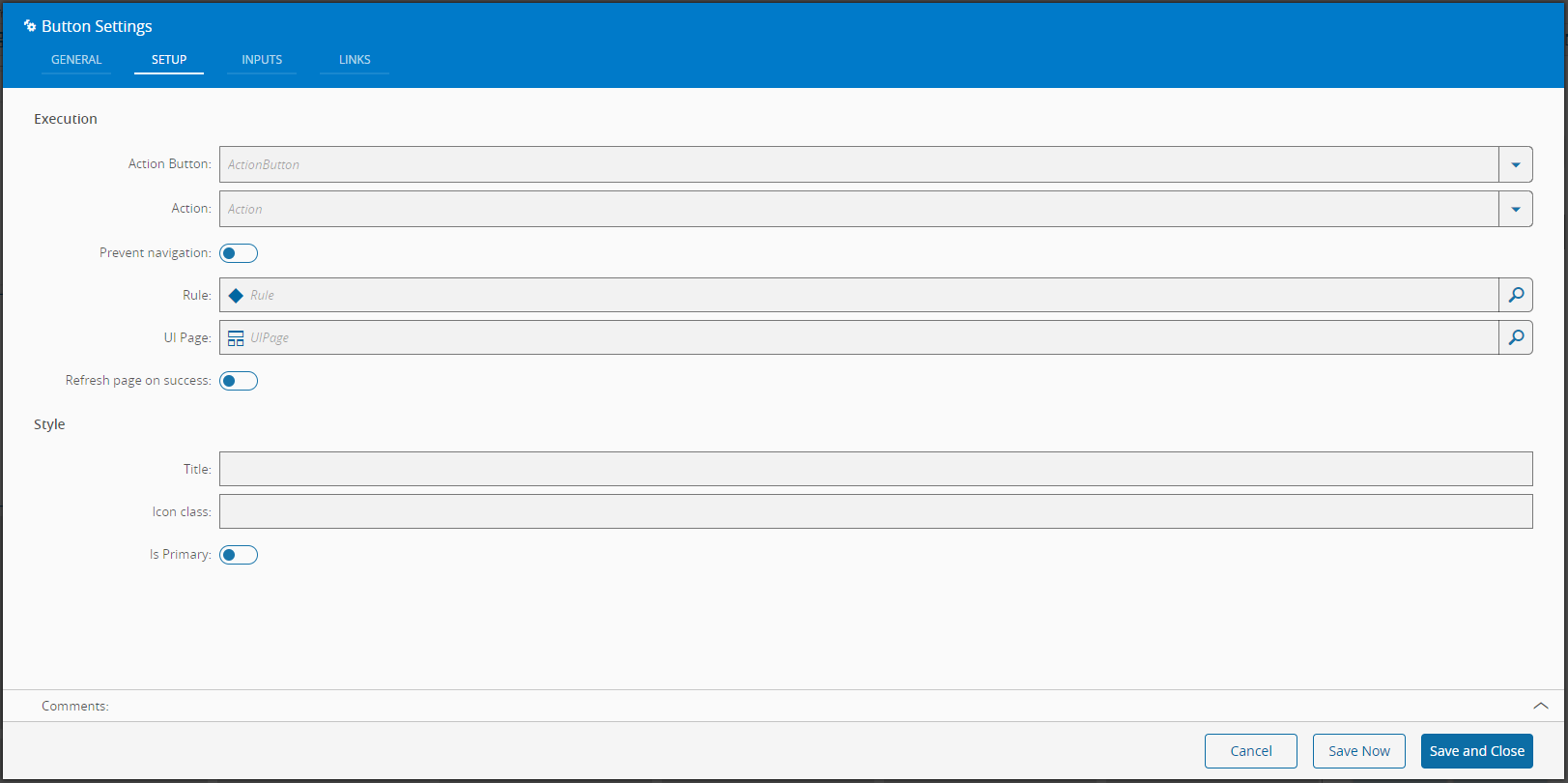
- In the setup tab provide what will happen when the user clicks the button.
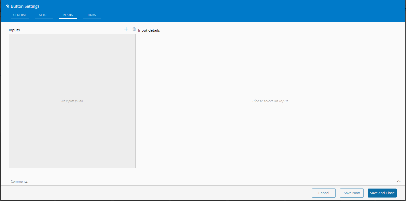
- Optionally define the inputs.
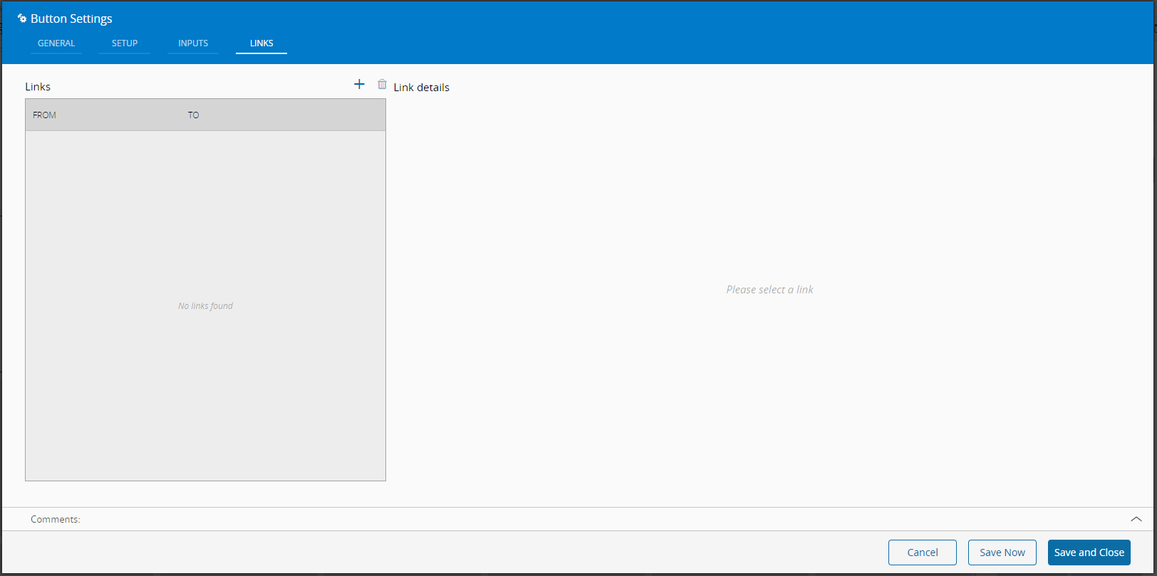
- Define the links between this Widget and other elements of the UIPage.
 By saving and closing the settings, the widget will be changed accordingly.