Countdown Timer Widget#
Overview#
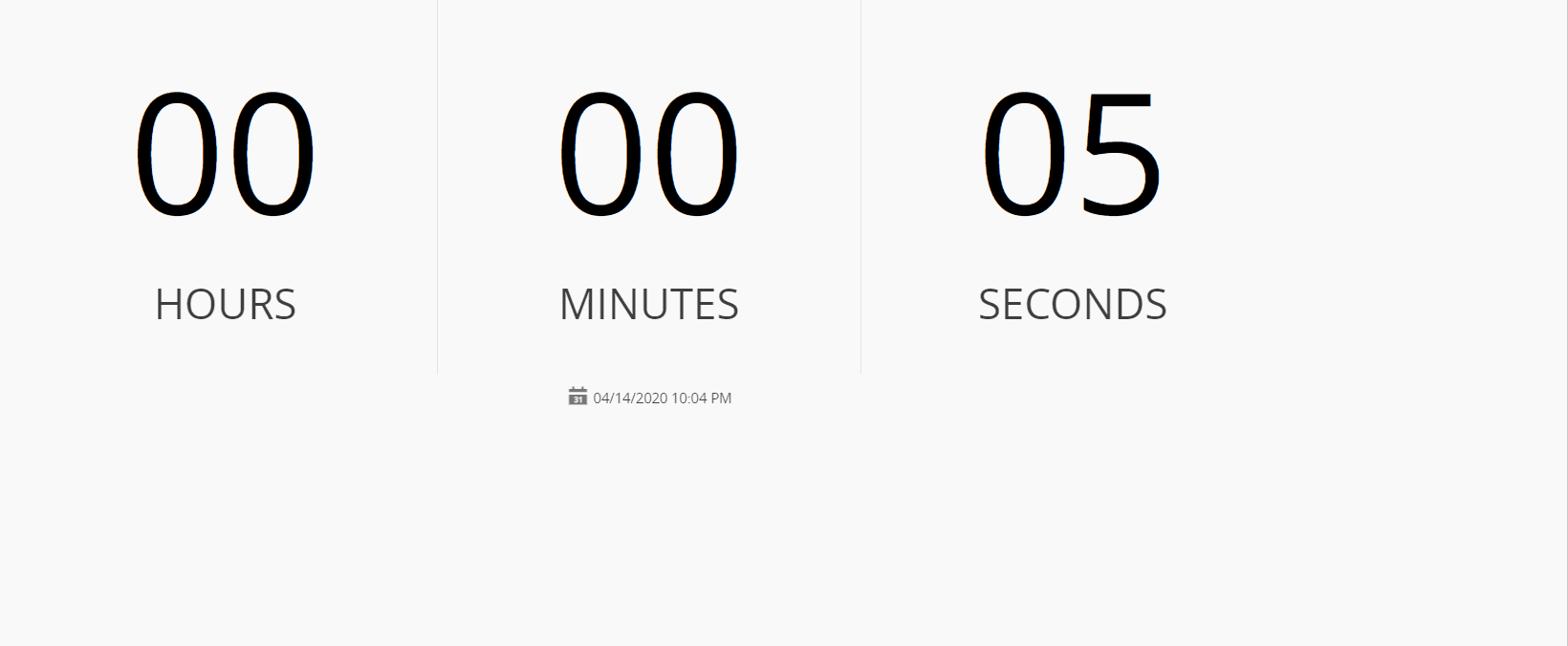
The Countdown Timer Widget places a timer in a UI Page that can be configured to run as a countdown timer or as a stopwatch. The user can configure the widget with an end date or with a specific time to countdown until the timer expires. Separate warning levels can also be configured so that the timer can change color to indicate that those thresholds have been reached. When the timer reaches zero, the time values on the widget will flash to indicate the final value has been reached.
To use the Countdown Timer Widget in an UIPage, follow the steps below:
- In any UIPage in Build mode, select the Countdown Timer Widget from the Widgets list located in the right side of the page, and drag and drop to the correct place in the UIPage.
- Enter the Settings section of the Widget.
-
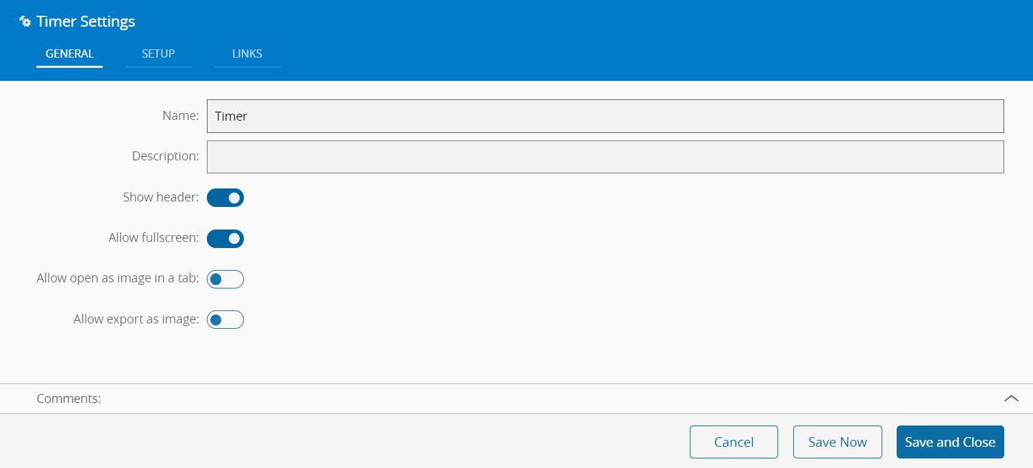
In the General tab, provide a name for the Widget, a description, and whether it should display the header and also if the user can activate the full screen mode. The user can also decide if the widget can be exported as an image.
-
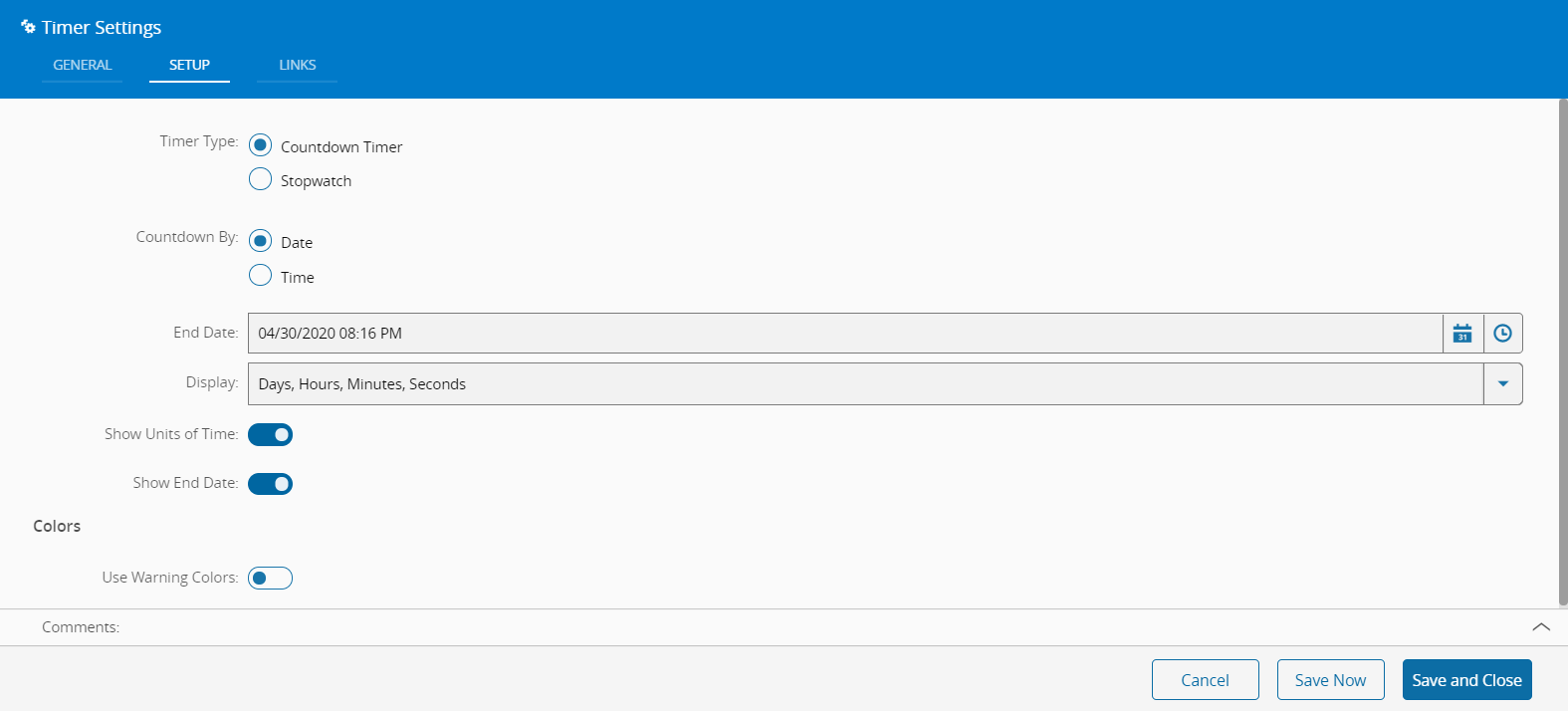
In the Setup tab, the widget can be configured through the following fields:
- Timer Type - Countdown Timer or Stopwatch
- Countdown by - Date or Time
- If Date is selected, the user can additionally choose the End Date and what to display on the widget in terms of date/time formatting. The user can also choose to show the units of time and to display the end date on the widget.
- If Time is selected, the user can additionally choose values for Days, Hours, Minutes and Seconds;
- Colors - the user can define the "Warning" and "Close to end" thresholds.
-
Optionally, define the links between this Widget and other elements of the UIPage in the Links tab.
- By saving and closing the settings, the widget will be changed accordingly.