Data Value#

Overview#
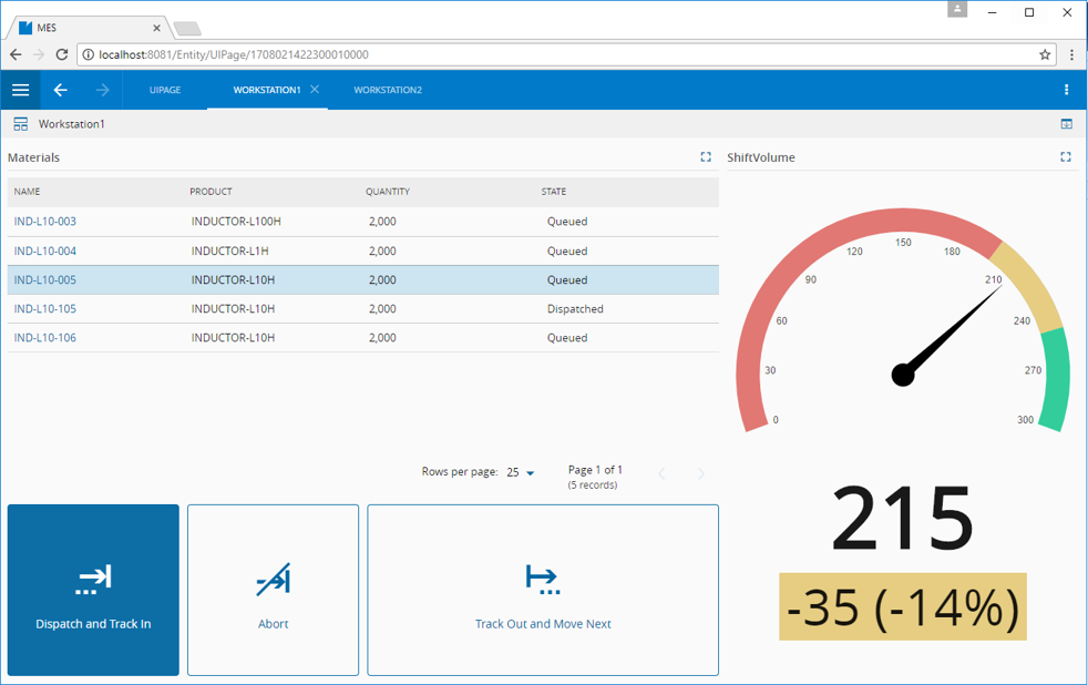
The Data Value widget provides a mechanism to display values by using a preset list of gauges. An example is shown below, where a Data Value widget is used to show the gauge on the right:
To use the Data Value widget in a UI Page, follow the steps below:
- In any UI Page in Build mode, select the Data Value widget from the widgets list located on the right; drag and drop to the correct place in the UI Page.
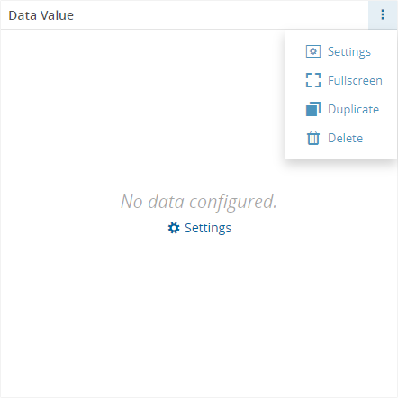
- Enter the Settings section of the widget via the vertical ellipsis or the link:
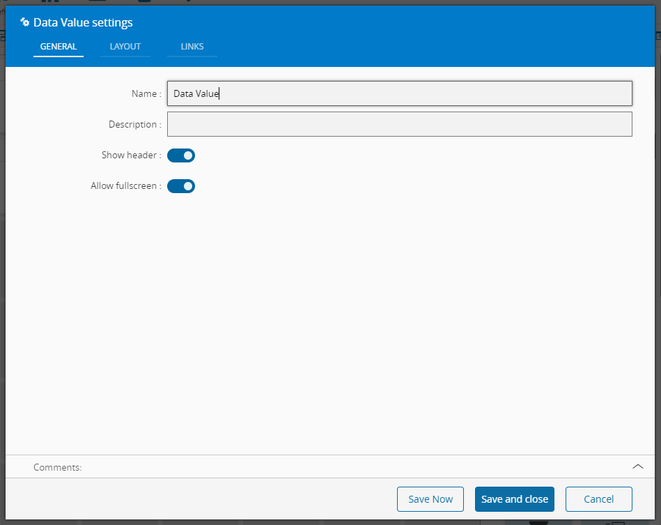
- In the General tab, provide a name for the widget, a description, specify whether it should display the header and also if the full screen mode should be active:
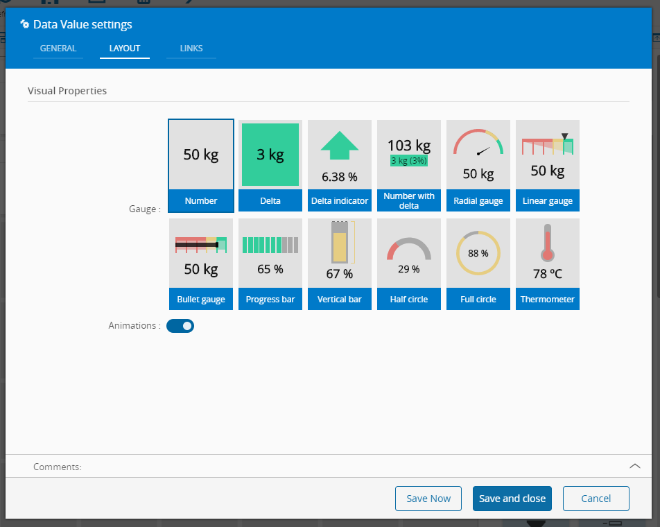
- In the Layout tab, the visual properties of the widget are configured:
-
Select the gauge type and specify whether animations should be displayed or not.
-
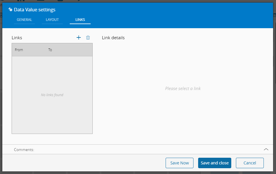
Optionally, define the links between this widget and other elements of the UI Page:
- By saving and closing the settings, the widget will be changed accordingly.