EDC Chart Widget#
Overview#
The EDC Chart Widget places a graph representation of all Data Collection Instances for a given set of Parameters, gathered for a specific context, in a UIPage. These representations can then be enhanced by displaying the actual collected parameter values or particular aggregated values for the Data Collection Instances.
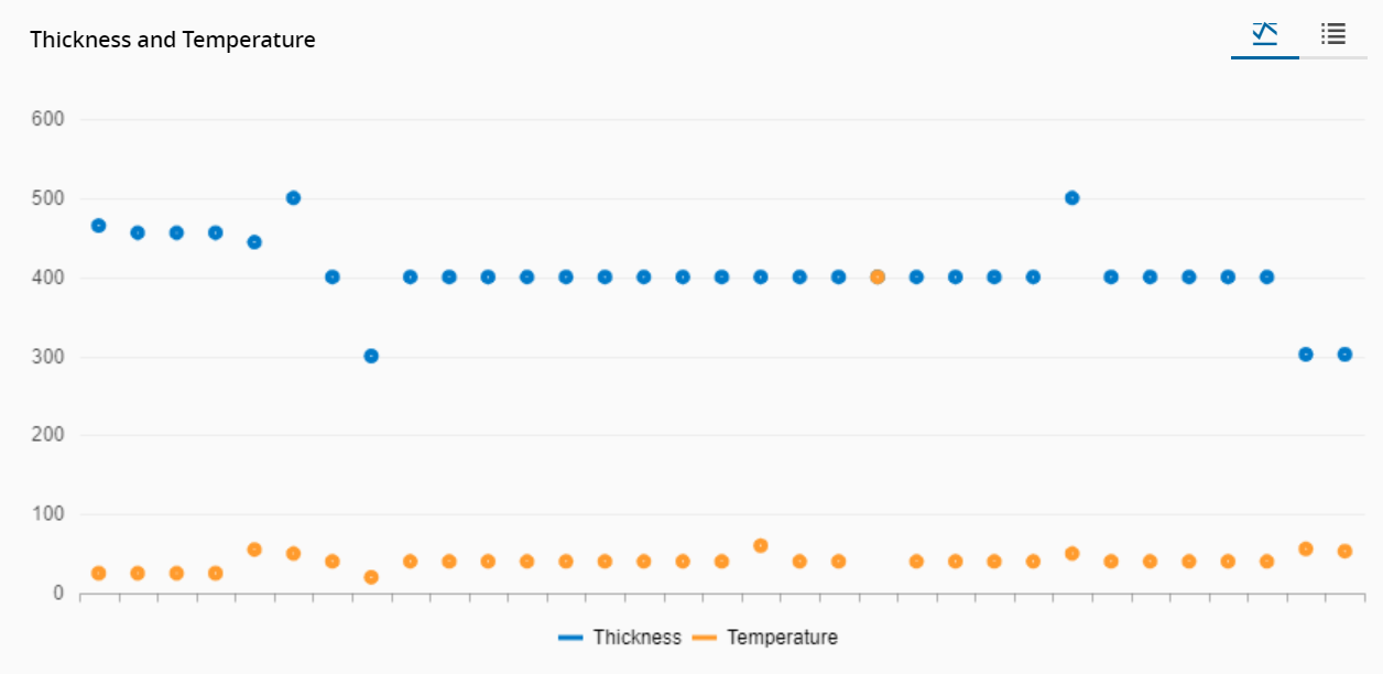
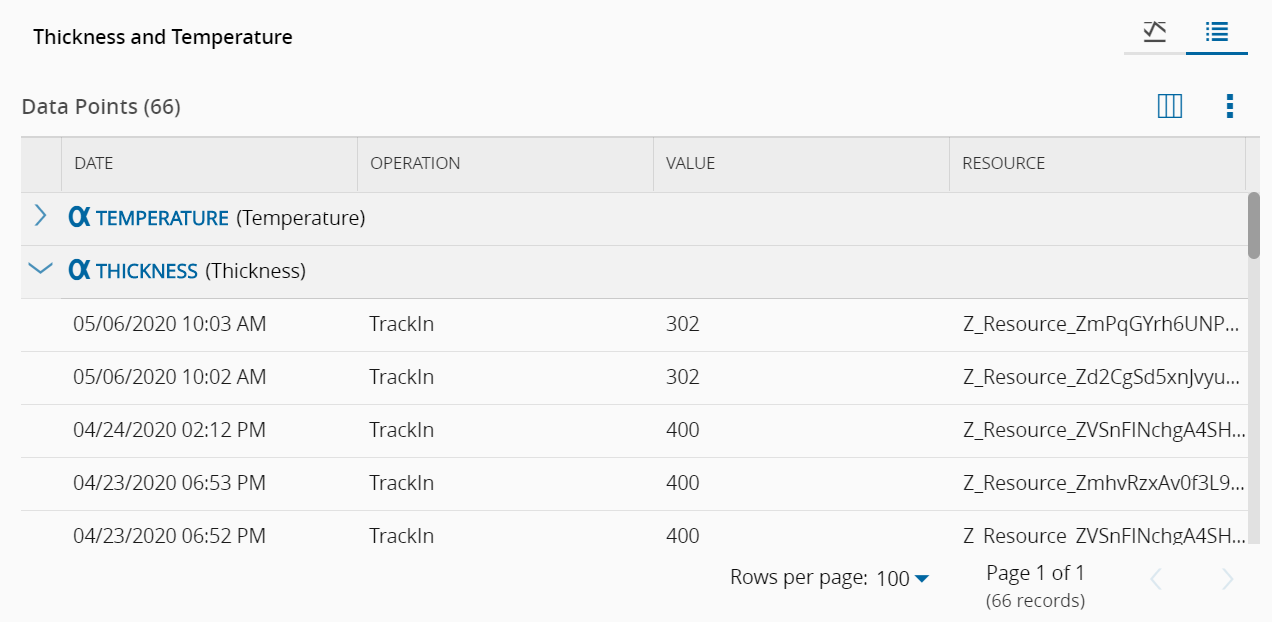
The user can choose to see the graphic visualization of the data or a table with the data itself:
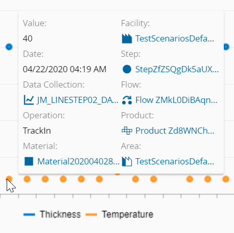
While in the graph visualization mode, hovering over the data points displays extra information on them:
To use the EDC Chart Widget in an UIPage, follow the steps below:
- In any UIPage in Build mode, select the EDC Chart Widget from the Widgets list located in the right side of the page, and drag and drop to the correct place in the UIPage.
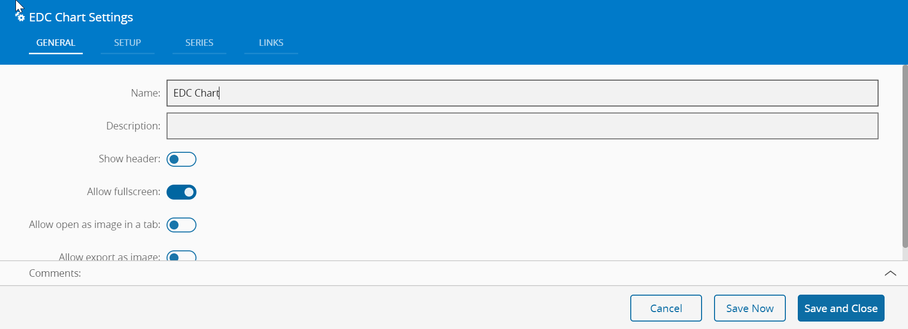
- Enter the Settings section of the Widget.
-
In the General tab, provide a name for the Widget, a description, and whether it should display the header and also if the user can activate the full screen mode. The user can also decide if the widget can be exported as an image.
-
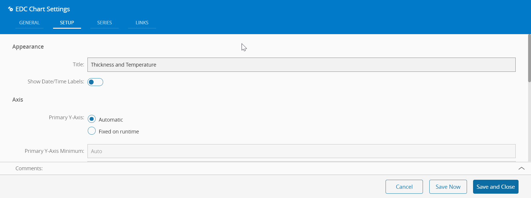
In the Setup tab, the widget can be configured through the following fields:
- Appearance
- Title of the widget, to be displayed at the top if selected;
- Show Date/Time labels for the data points
- Axis
- Primary Y-Axis:
- Automatic
- Fixed on runtime - so that it remains fixed when being viewed. If selected, define the minimum and maximum values for the Y-Axis
- Display Default filter mode:
- Last number of points (if selected, define the number of points to be visible)
- Date interval. If selected, also define:
- From date
- To date
- Mode:
- Scatter: show the values on the graph
- Group: group the values by time unit and aggregate function (e.g. Average/Minute for the defined date interval)
- Filters - the user can define the context that should be used as a filter for the data to be displayed. Available filters are:
- Facility
- Area
- Step
- Resource
- Product
- Flow
-
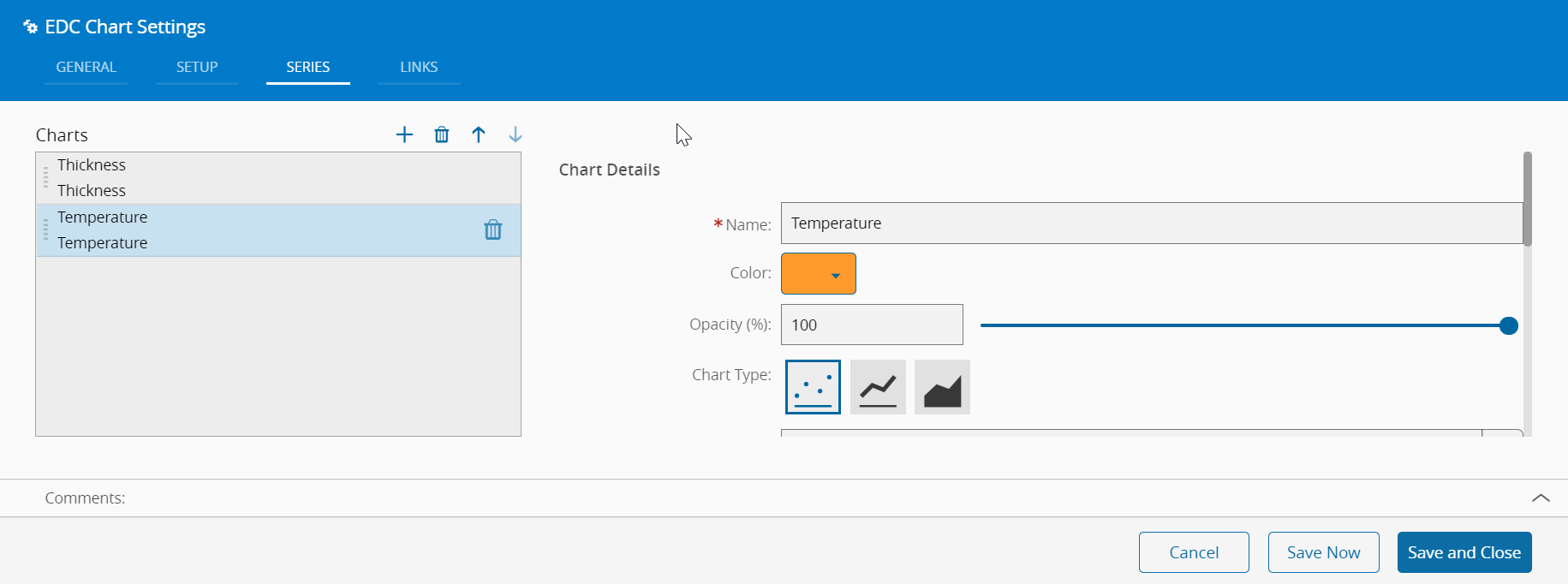
In the Series tab, one or more series of data (Charts) as desired (press in the top right of the grid to add, to remove, and to specify the order in which they should be displayed), specifying for each Chart:
- Details
- Name
- Color of data points
- Opacity (0-100%)
- Chart Type
- Points
- Line
- Area
- Parameter
- Aggregation
- Level
- None
- Parameter
- Average
- Maximum
- Minimum
- None
- Range
- Rule
- Standard Deviation
- Sum
- Sample
- Filters - the user can define the context that should be used as a filter for the data to be displayed for the current series. Available filters are:
- Facility
- Area
- Step
- Resource
- Product
- Flow
-
Optionally, define the links between this Widget and other elements of the UIPage in the Links tab.
- By saving and closing the settings, the widget will be changed accordingly.