Keypad#

Overview#
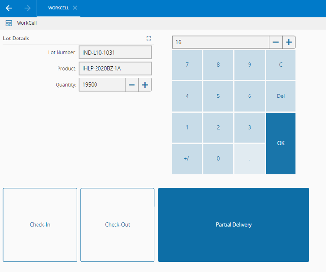
The Keypad Widget provides an onscreen numeric keyboard to input values in an UI Page. An example of an UI Page using a Keypad Widget is shown below.
To use the Keypad Widget in an UIPage, follow the steps below.
- In any UIPage in Build mode, select the Query Widget from the Widgets list located in the right side of the page, and drag and drop to the correct place in the UIPage.
- Enter the Settings section of the Widget.
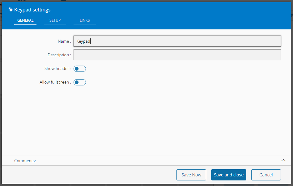
- In the General tab, provide a name for the Widget, a description, specify whether it should display the header and also if the user can activate the full screen mode.
- In the setup tab provide execution related properties such as:
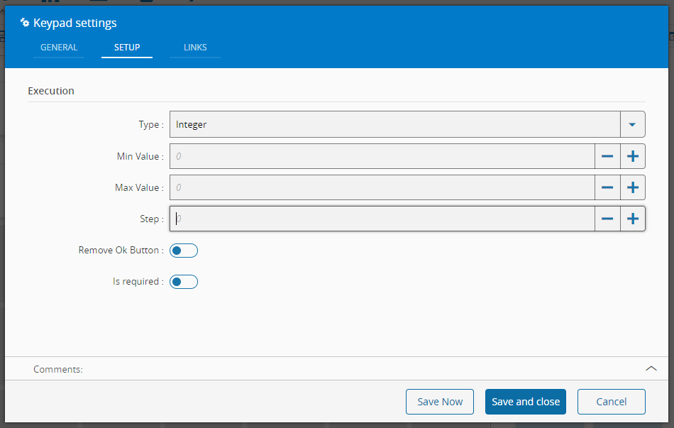
- The type, choose between Integer, Long or Decimal
- The min Value, set the minimum value acceptable as input
- The max Value, set the maximum value acceptable as input
- The step, value to add or subtract when using the plus and minus buttons
- The visibility of the Ok Button
- Whether the value is required or not
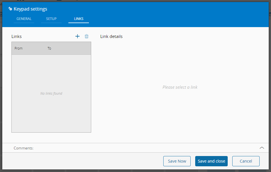
- Optionally, define the links between this Widget and other elements of the UIPage. As this widget doesn't provide any output it can only be used as target. The URL property, for example, can be used as input.
- By saving and closing the settings, the widget will be changed accordingly.