Text Widget#
Overview#
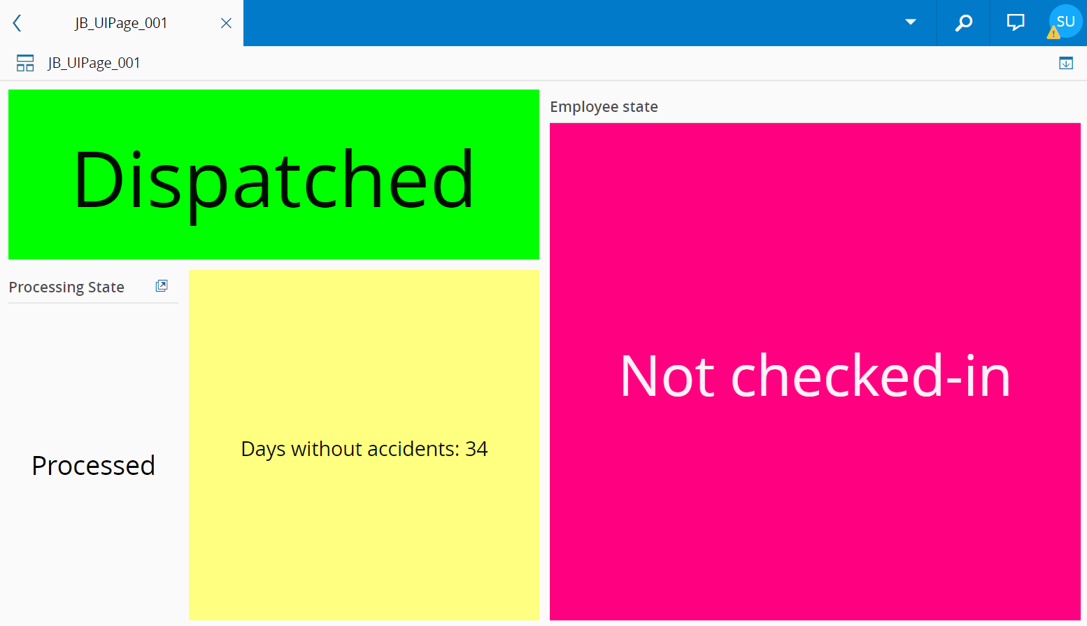
The Text Widget displays static or dynamic text in a UI Page. The user can configure the widget to receive the value to display from an external data source or a static text message can be displayed on-screen.
To use the Text Widget in an UIPage, follow the steps below:
- In any UIPage in Build mode, select the Text Widget from the Widgets list located in the right side of the page, and drag and drop to the correct place in the UIPage.
- Enter the Settings section of the Widget.
-
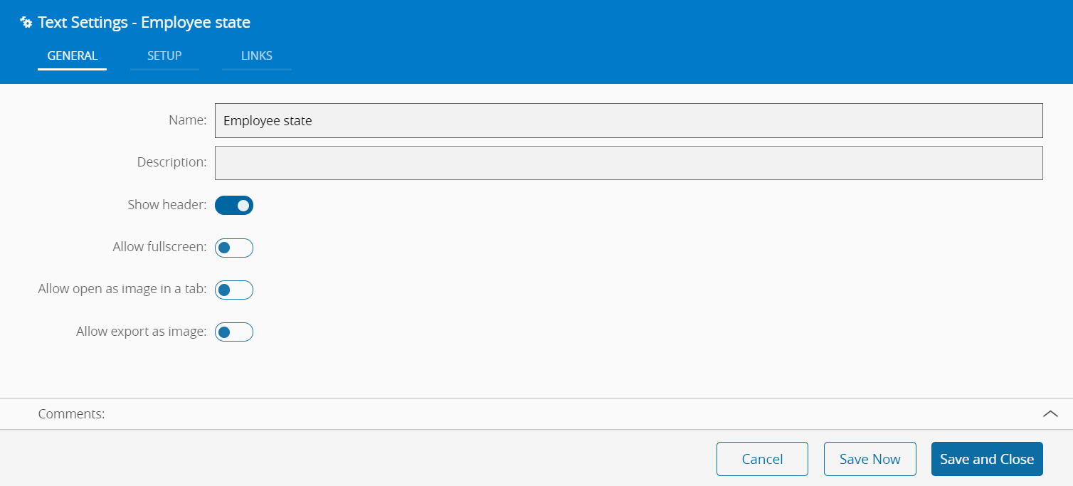
In the General tab, provide a name for the Widget, a description, and whether it should display the header and also if the user can activate the full screen mode. The user can also decide if the widget can be opened as an image in another tab or exported as an image.
-
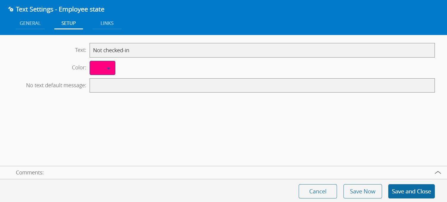
In the Setup tab, the widget can be configured through the following fields:
- Text - What to display in the widget
- Color - The user can select the background color from the system color pallet. The foreground color will change accordingly in order to provide maximum legibility
- No text default message - If the user links the Text field to a dynamically source, a default message can be displayed when this source is empty.
-
Optionally, define the links between this Widget and other elements of the UIPage in the Links tab.
- By saving and closing the settings, the widget will be changed accordingly.