---
alias: user-guide-uipages-design
description: "This documentation guides you through designing and editing UI pages using a visual editor. It covers steps for creating layouts,"
---
# Design UI Page
:lock: UIPage.**Design**
:lock: UIPage.**Edit**
:lock: UIPage.**Save**
:lock: UIPage.**Show**
## Overview
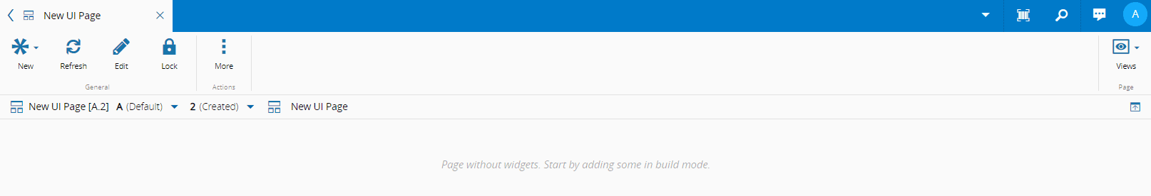
To have a fully functioning **UI Page** follow the steps below.
## Sequence of Steps
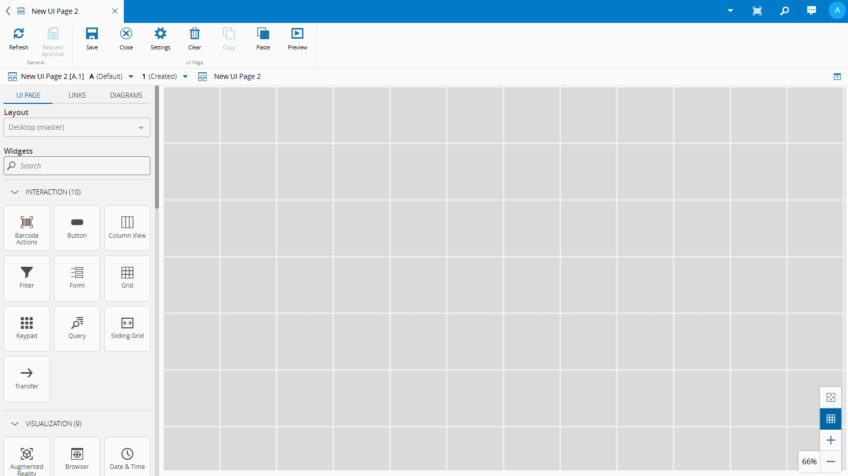
1. To access the Design View, select **Edit** from the top ribbon.
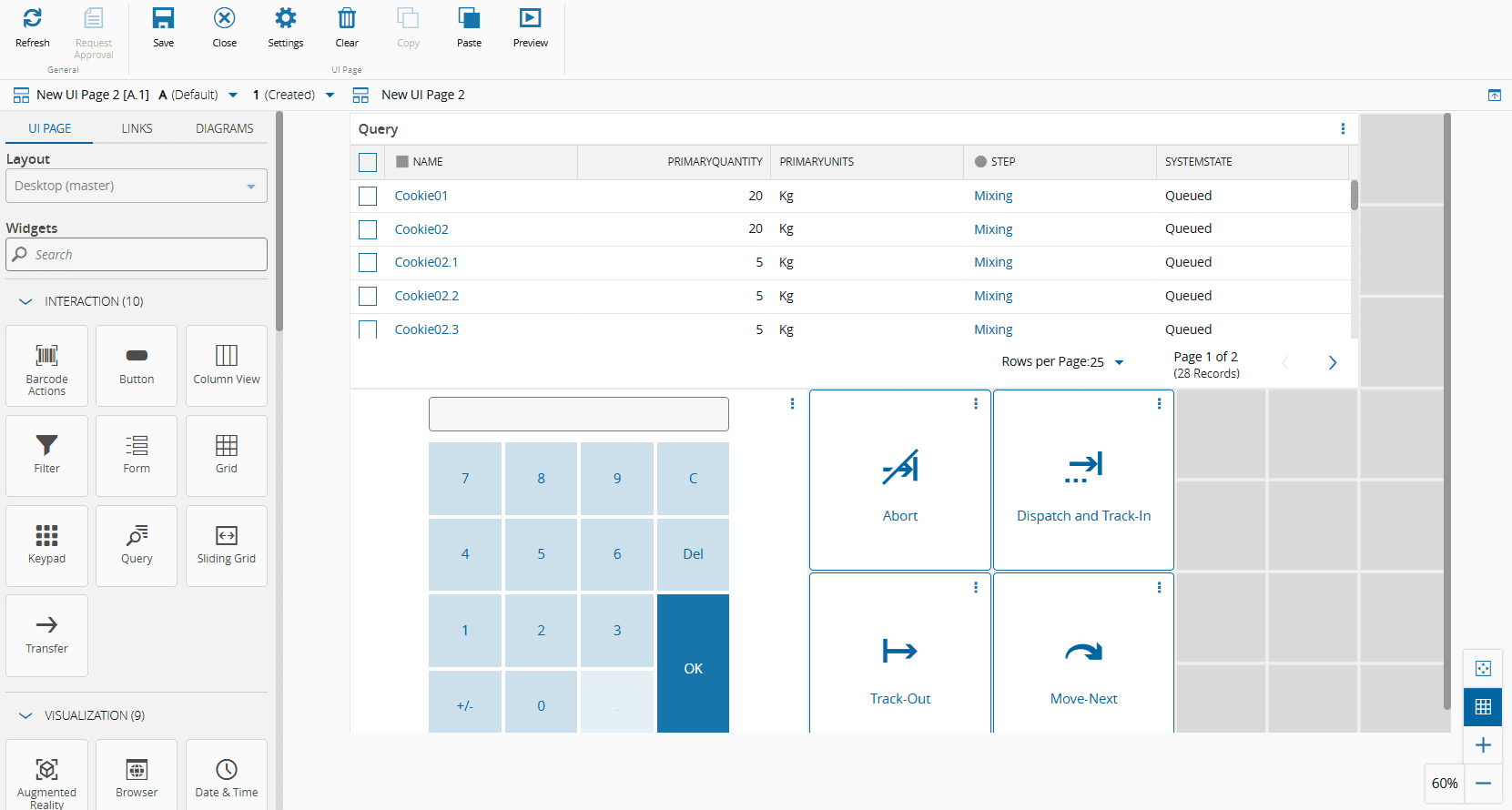
2. Populate the page by dragging and dropping widgets from the left-side panel into the desired areas. Use the :material-plus: and :material-minus: buttons to zoom in and out on the UI Page. To fit the entire UI Page to your viewport, select the :core-static-fittowindow-sm: button. You can toggle the grid view with the :core-static-widgetgrid-sm: button.
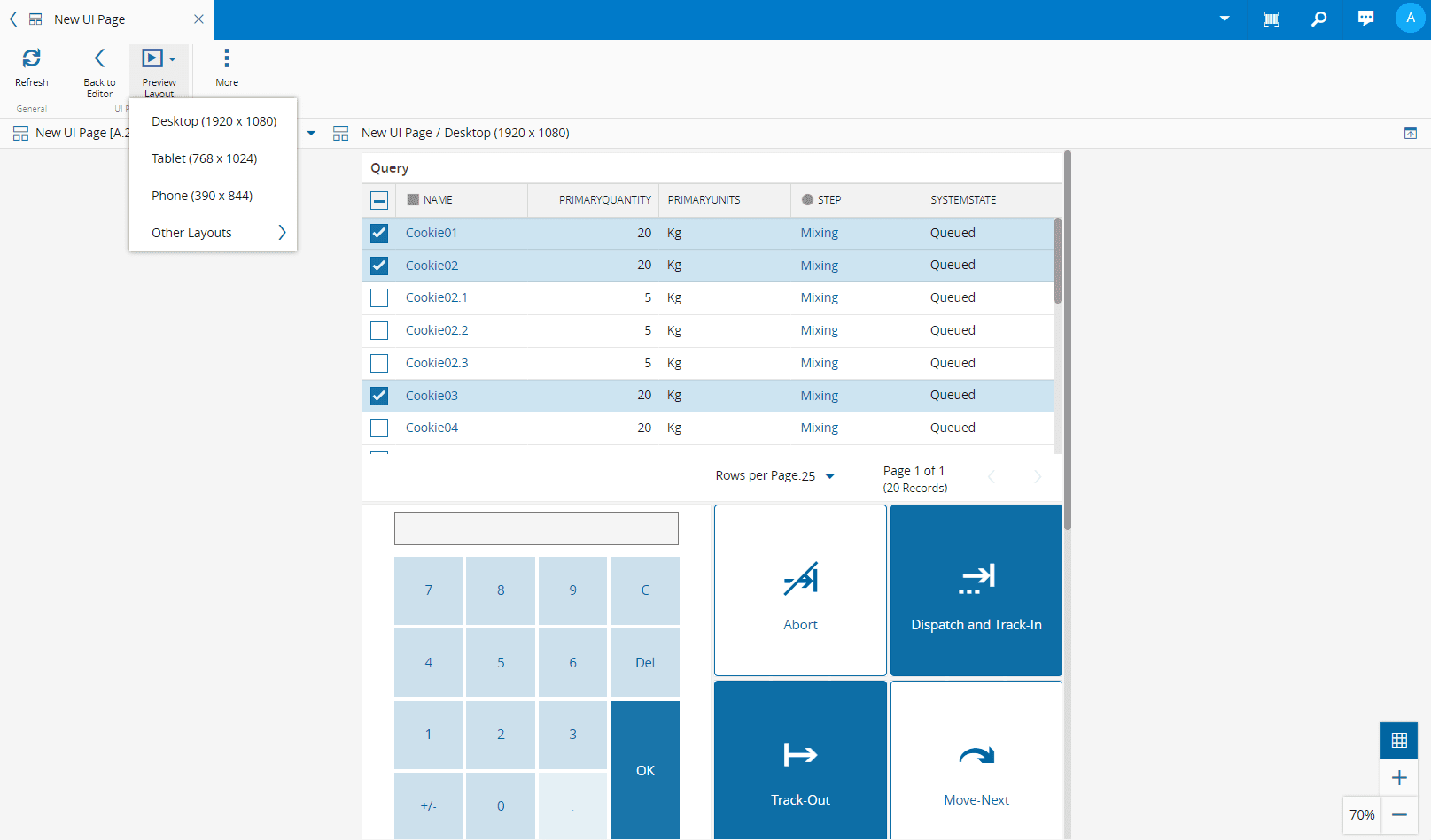
3. Select **Preview** from the top ribbon to see your **UI Page**. In Preview Mode, you can choose the layout from the **Preview Layout** dropdown menu. To continue editing the UI Page, select **Back to Editor** from the top ribbon.
4. Once you are satisfied with the layout, select **Save** from the top ribbon.
5. To return to the **Edit Mode**, select **Edit** from the top ribbon.
## Page Builder Settings
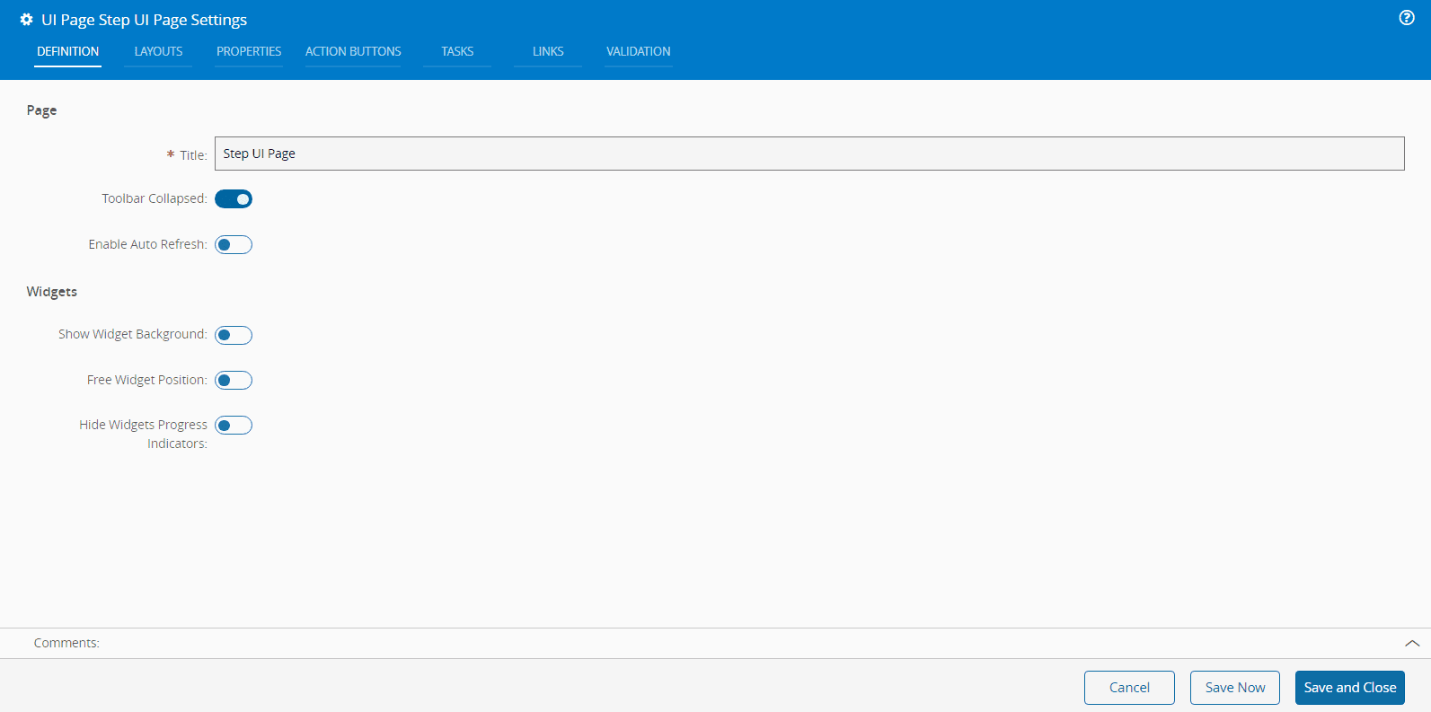
### Definition
In the **Definition** tab you can set the **Title** of the page, which defaults to the name of the **UI Page**.
Additionally, you can configure:
* **Page display settings**
* **Toolbar Collapsed** - expand or collapse the **UI Page** action bar.
* **Enable Auto Refresh** - enable or disable automatic page refresh.
* **Widget settings**
* **Show Widgets Background** - show or hide the background of all the widgets on the **UI Page**.
* **Free Widget Position** - enable or disable free placement of widgets within the grid.
* **Hide Widgets Progress Indicators** - show or hide progress indicators for widgets.
!!! warning
If you the Free Widget Position toggle button is set to `False`, the widgets will always occupy the top-left corner.

### Layouts
The **Layouts** tab displays the existing layouts and allows you to :material-plus: or :material-trash-can: layouts.
To :material-plus: a new layout, choose one from the dropdown available in the Page Settings wizard. When you select a predefined layout, the Name, Size Width and Height fields will be automatically populated. You can customize these default values or add new ones by editing the [[uipagelayouts-gt]] Generic Table.
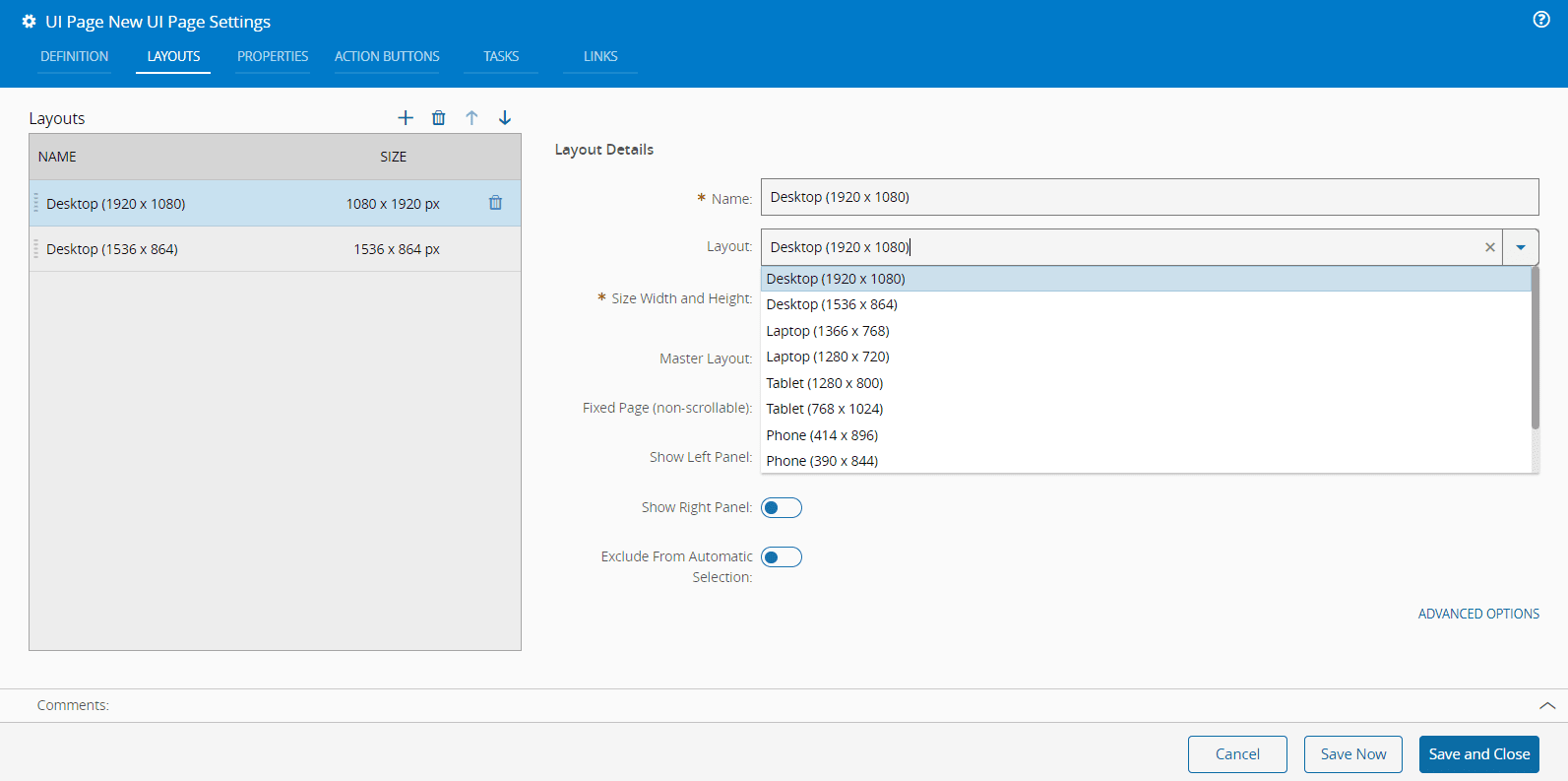
In this wizard, you can also specify if a layout is a master layout, although only one master layout can be defined per UI Page. A visual indicator will show which layout is the master layout in the dropdown when in editing mode.
Additionally, you can or disable the following layout features: **Fixed page (non-scrollable)**, **Show left panel**, **Show right panel**, and **Exclude From Automatic Selection**.
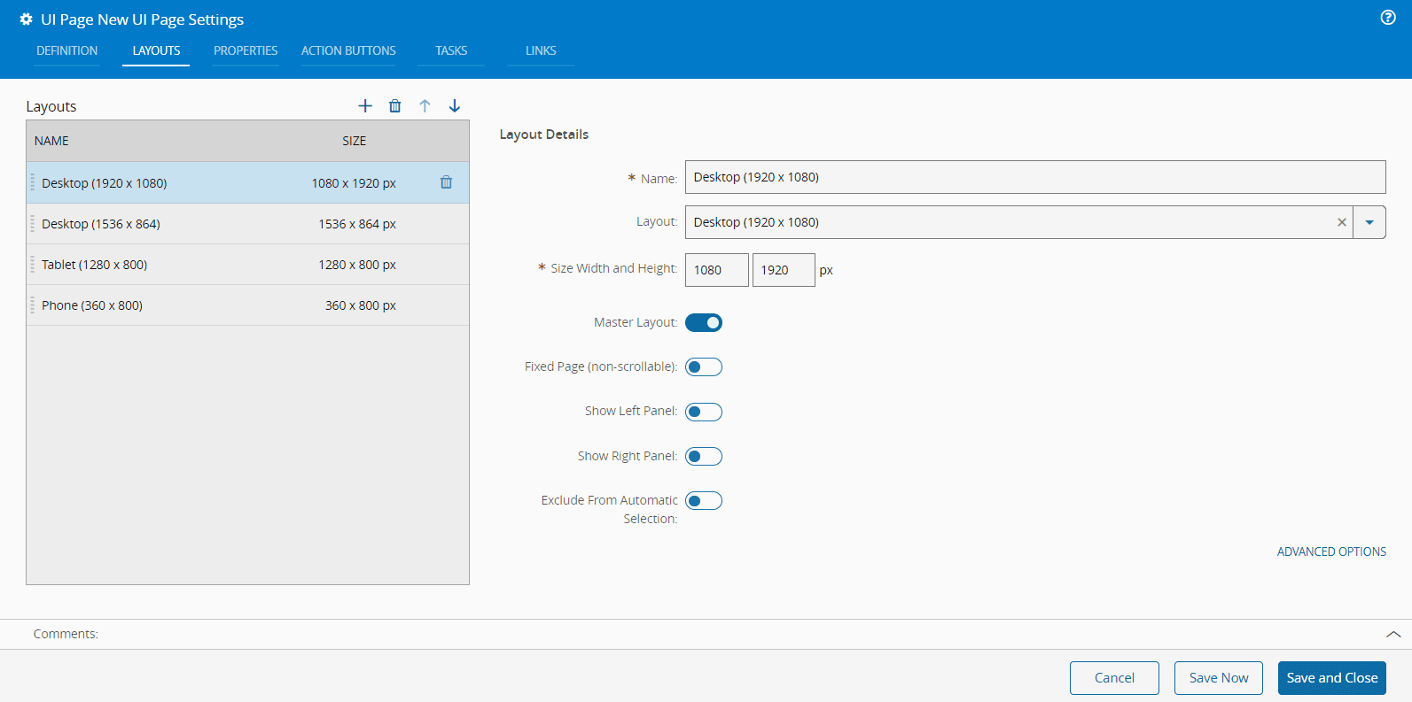
If you select **Advanced Options**, you can customize the Grid Details, including the number of columns, column widths, and gutter width. To revert to the default settings, click the **Apply Default** button.
!!! warning
The **Apply Default** button is only available for layouts defined in the [[uipagelayouts-gt]] Generic Table.
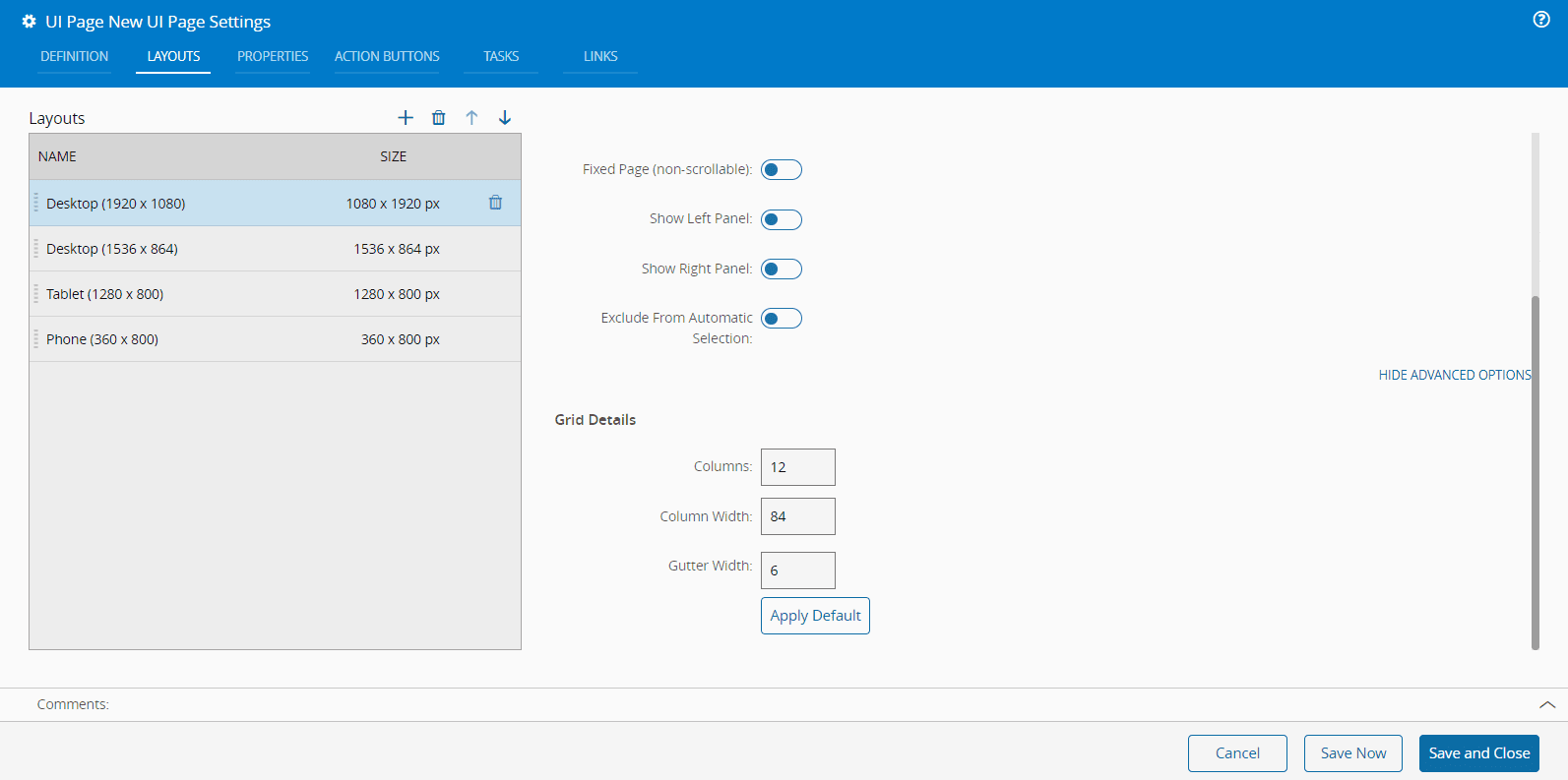
!!! note
The fields in the Grid Details section automatically update when you change any of the values.
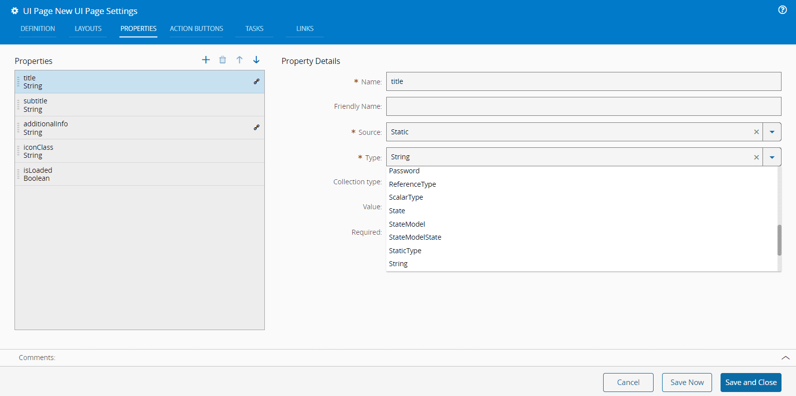
### Properties
Properties are used to share information among page elements.
Similar to the previously described tab, the properties tab can be used to maintain page properties by adding (:material-plus:) or removing (:material-trash-can:) them.
The properties must have a **Name** and **Source**.
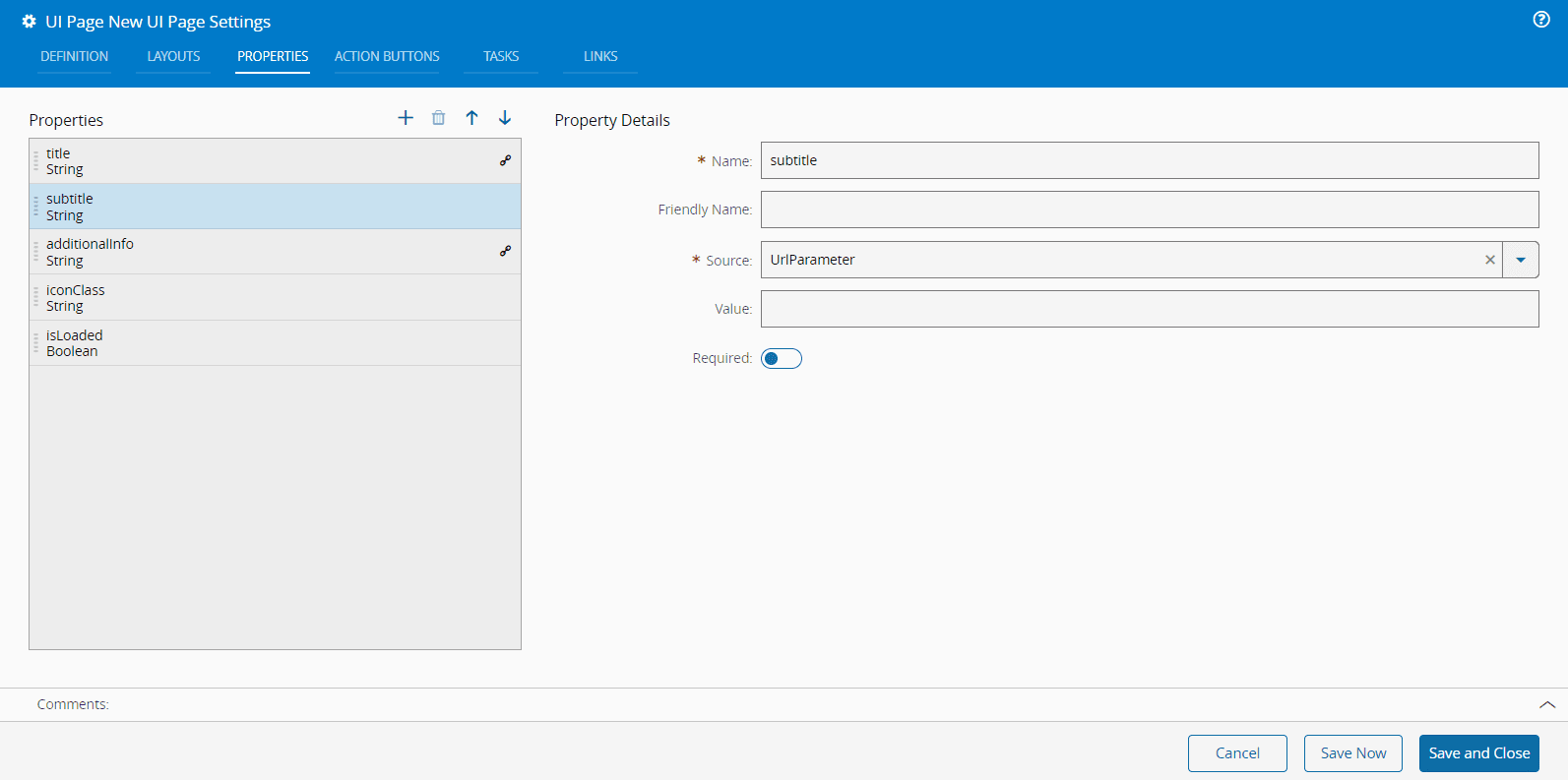
The **Source** can be **Static** or **URLParameter**.
If the **Source** is **Static**, you must define a **Type** from the available options:
If the **Source** is **URLParameter**, you, optionally, need to define a **Value** and enable or disable the **Required** flag, which defines if the property is mandatory or not.
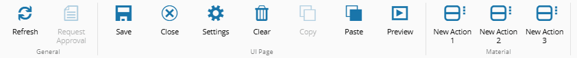
### Action Buttons
The **Action Buttons** tab has extra buttons that can be managed in this tab.
It is also possible to change the display order of the buttons by using the :material-arrow-up: and :material-arrow-down: arrows.
To :material-plus: a new button to the page you only need to define the **Name**. Optionally, you can provide the **Description** and **Alignment** (Left/Right). Also, available are the **Dropdown**, **Hide**, and **Disable** options as well as the **Action Group** setting.
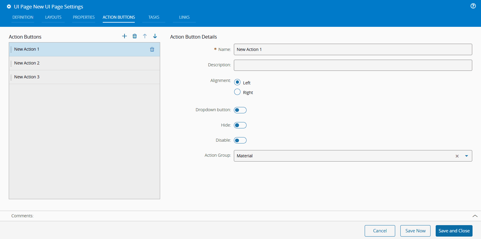
If you define an **Action Group** when creating the **Action Buttons**, they will be grouped accordingly and the name of the **Action Group** will be displayed below the buttons, as shown in the image below.
To assign actions to newly created buttons, follow the steps described in the [[user-guide-uipage-widgets-button]] section.
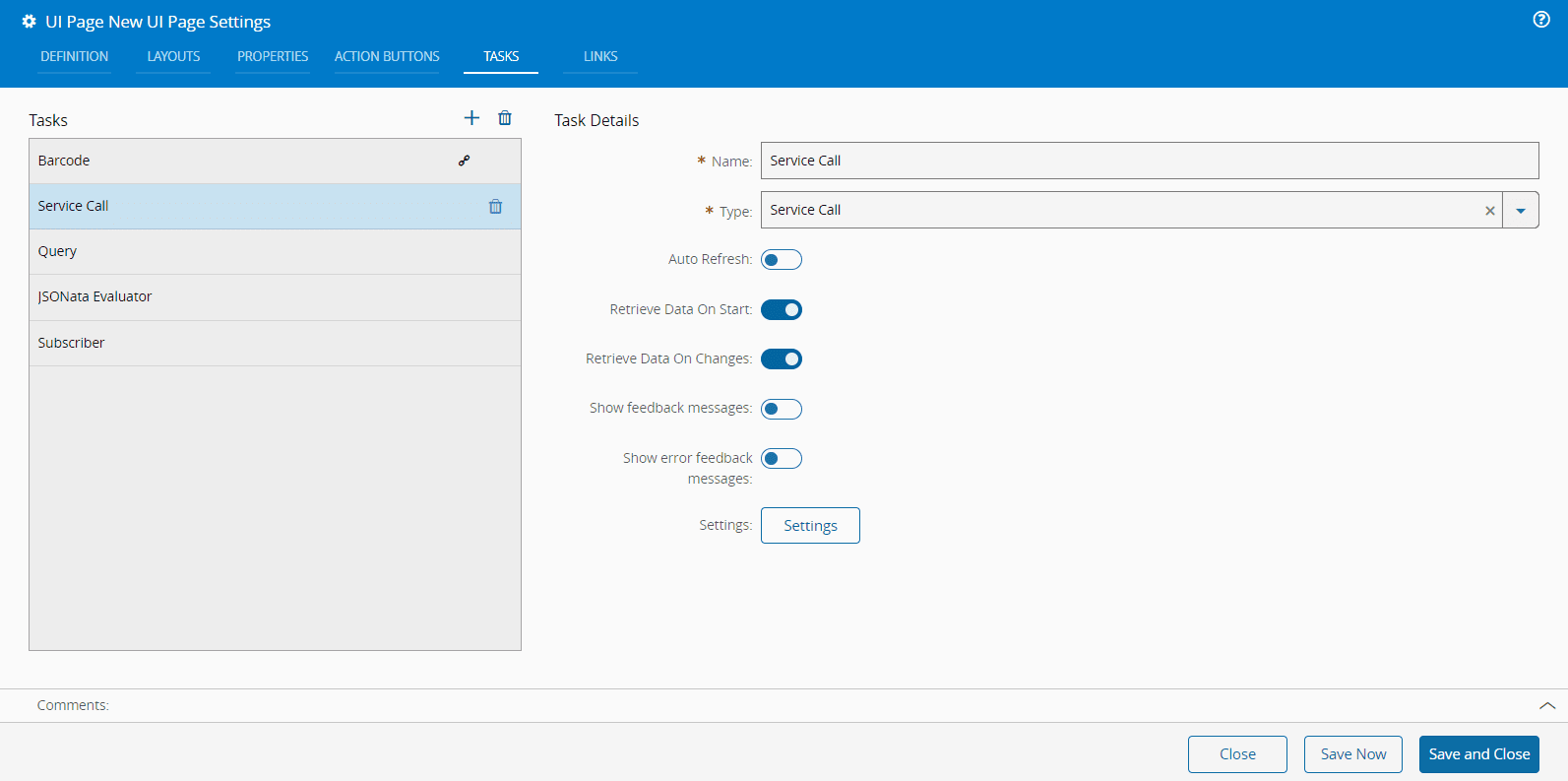
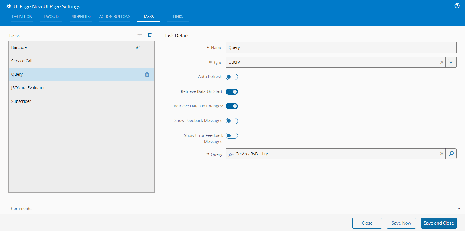
### Tasks
**Tasks** provide a convenient way of loading data within the **UI Page**. This data can be used within a link as a way of providing information needed to the available widgets.
The defined **Tasks** are listed in this tab and can be managed (as in previous tabs).
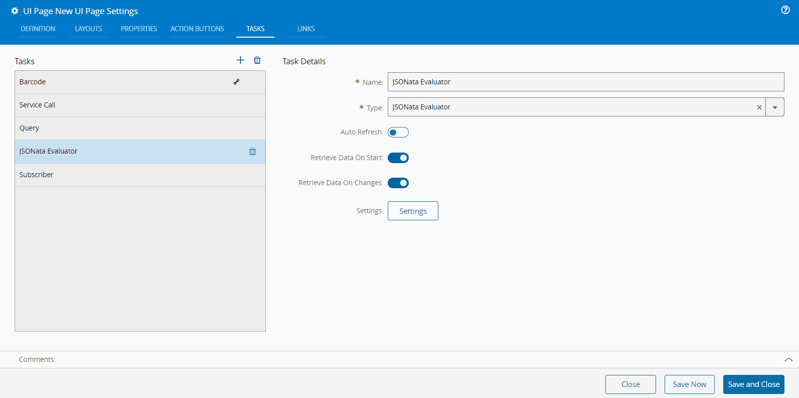
For each **Task** it is mandatory to define a **Name** and **Type**.
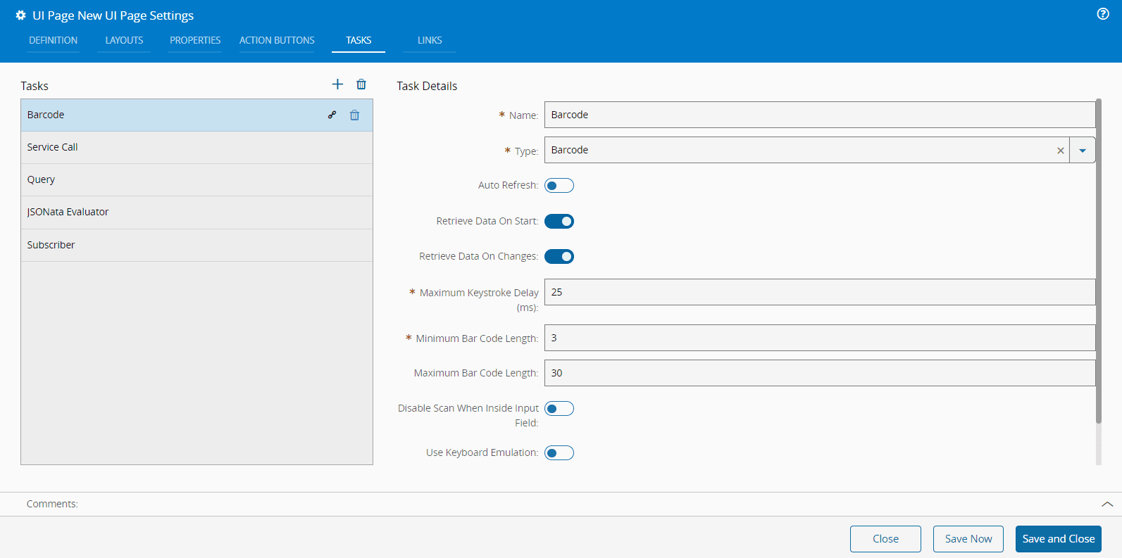
The **Type** field has many options and some of them have additional mandatory fields as shown in the print above and in the selection of prints below:
=== "Service Call Task"
=== "Query Task"
=== "JSONata Evaluator Task"
=== "Subscriber Task"
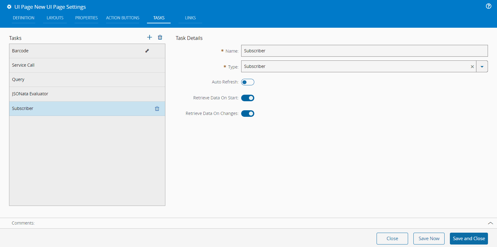
The different types are described in the [[user-guide-uipage-system-tasks-index]] section. Depending on the **Type** you select, be sure to complete all the mandatory information before you **Save and Close**.
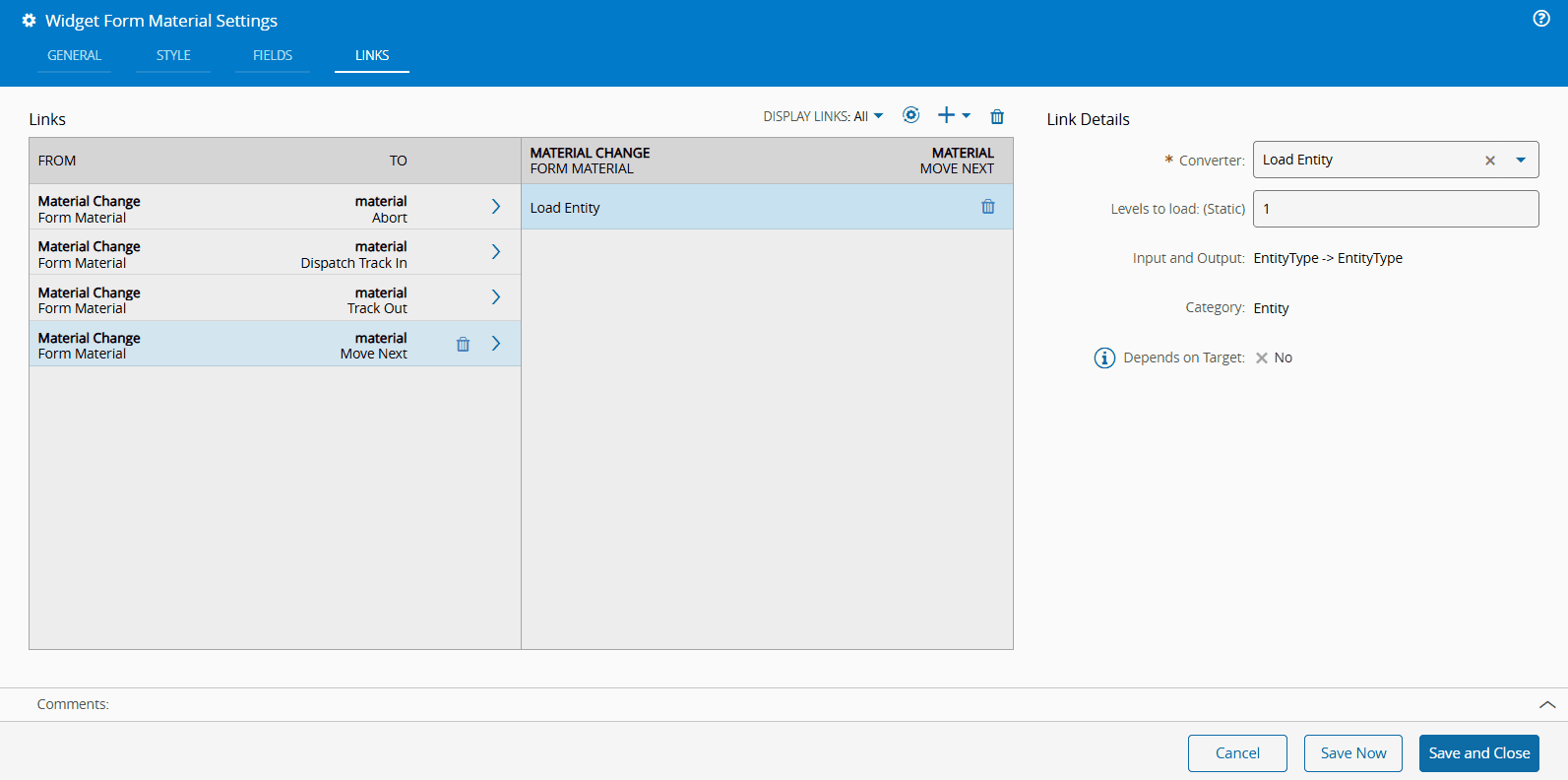
### Links
The **Links** tab allows you to manage the links between page elements that share data among them. These links can be managed similarly to previous tabs. Once you configured the link details, you can validate the links using the :core-static-validate-sm: button.
For example, when you select **Page** from the **Source** dropdown:
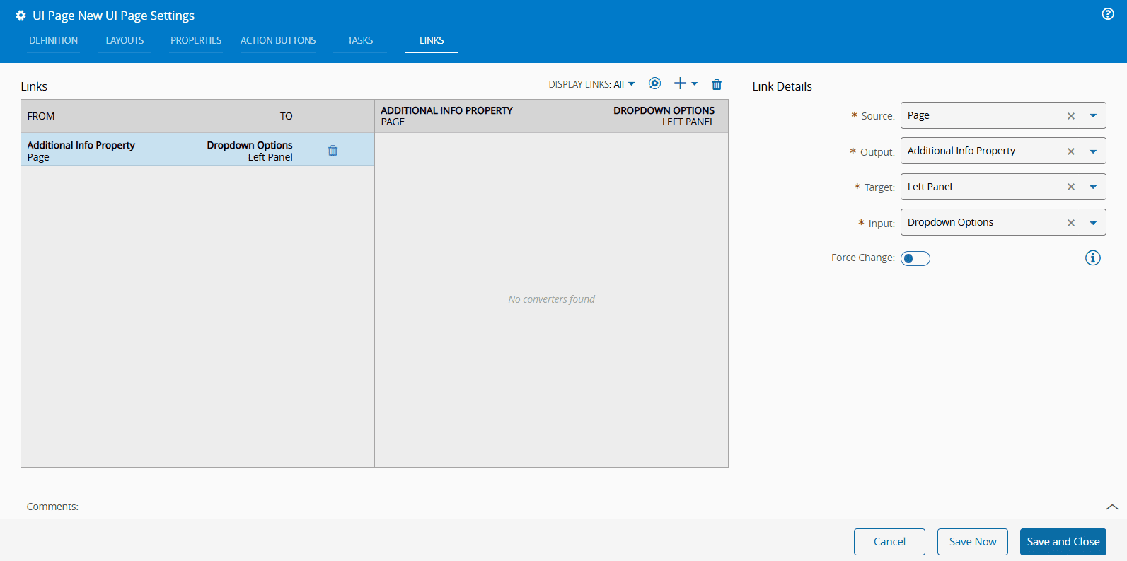
You must specify the **Source**, **Output**, **Target**, and **Input** fields. The system will guide you to select the correct fields based on your previous selections.
Another example is when you select **Left panel** from the **Source** dropdown:
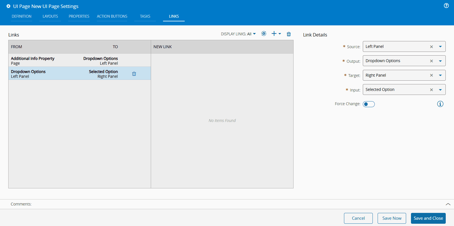
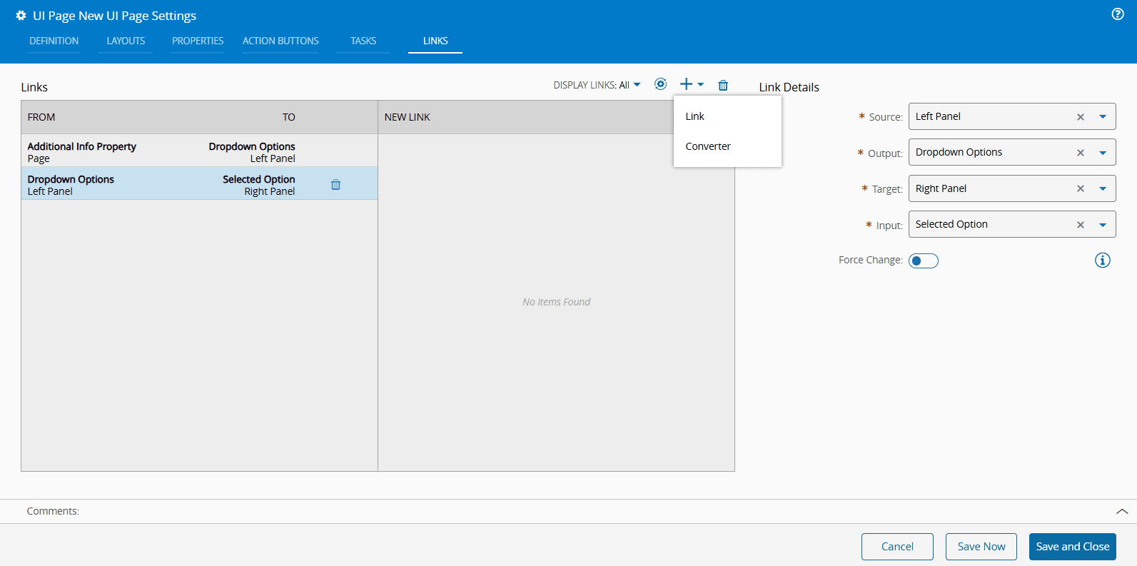
As shown above, the same mandatory fields — **Source**, **Output**, **Target**, and **Input** — apply here. The system ensures the appropriate fields are selected to match your configurations. You can add more Links by selecting the :material-plus: button. You can also add one or more Converters in the same dropdown menu. For more information, see [[user-guide-uipages-converters]].
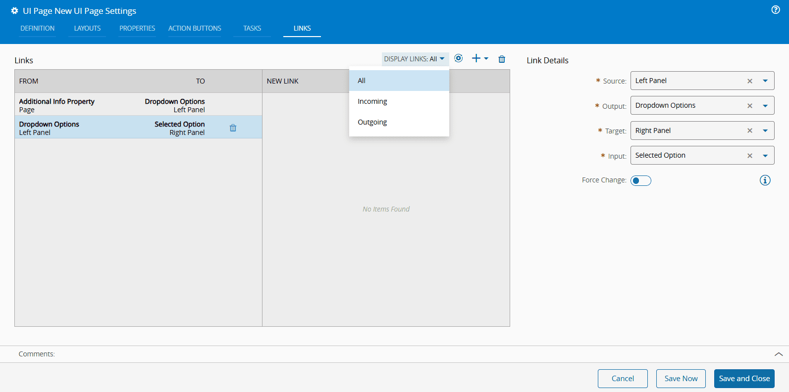
Additionally, you may choose to Display All Links, or filter them by Incoming and Outgoing.
## Creating Steps and Wizards
The creation of a **UI Page** of the type **Step** and **Wizard** is similar to the creation of a **UI Page** of type **Page**, as described in the section [[user-guide-uipages-create-uipage]].
After creation, the **UI Page** of the type **Step** and **Wizard** will be displayed empty. Enter the Design View by selecting **Edit** on the top ribbon, followed by **Settings**.
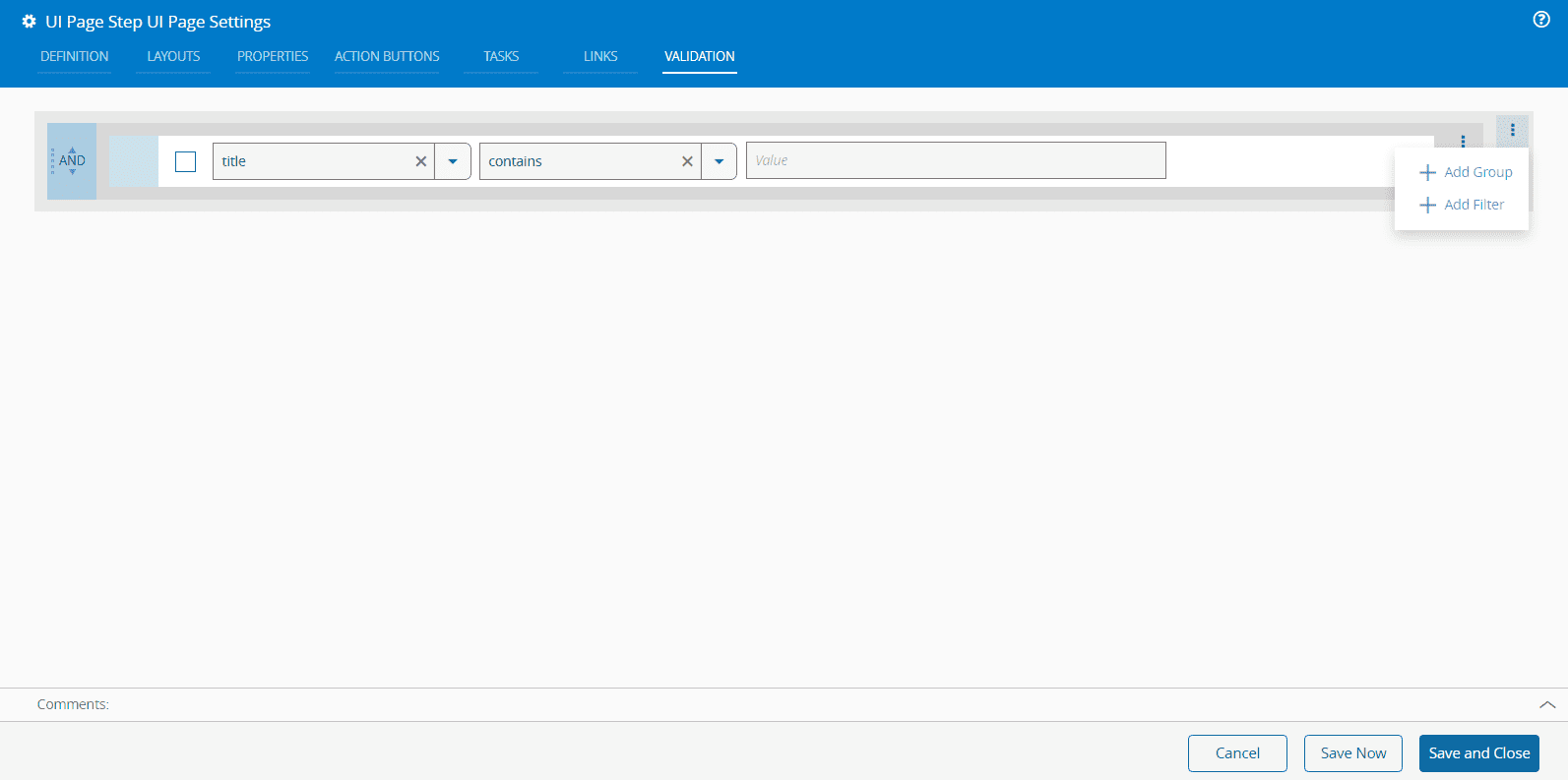
An extra **Validation** tab will be visible in the **Page Builder Settings**.
For the **UI Page** of type **Step**, the **Validation** tab allows you to create a Boolean expression that will be used by the system to validate the step:
For the **UI Page** of type **Wizard**, there is also a **Validation** tab but there is no **Layout** tab as the layouts are managed by the system. The **Show Grid Layout** property is also managed by the system and cannot be set.
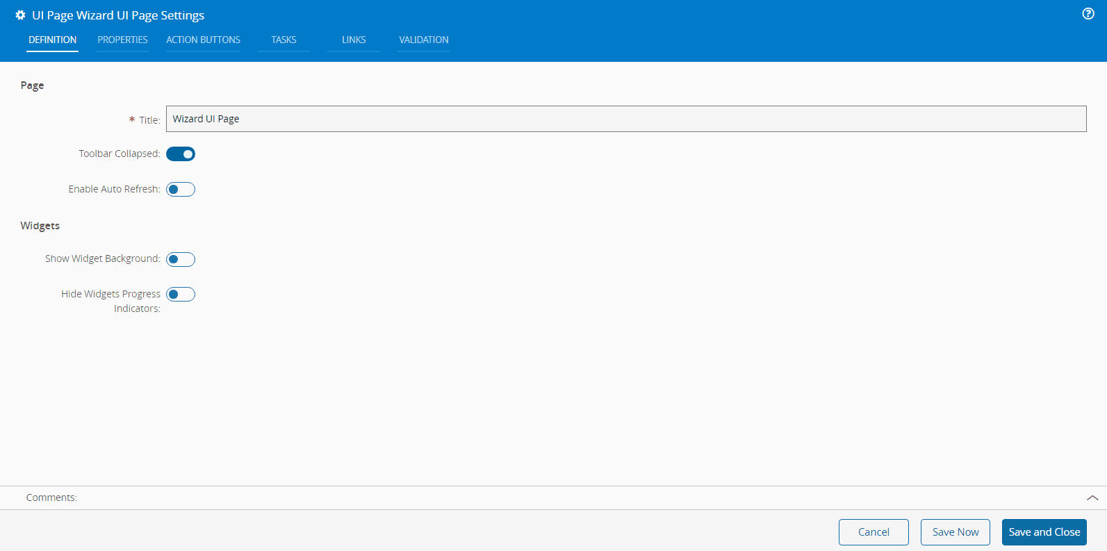
In both cases, **UI Pages** of type **Step** and **Wizard**, you must **Save and Close** for the **Validation** to take effect.
## Widgets Categories
To help you build and customize UI Pages, you can use the widgets available on the left-side panel. To simplify this process, widgets are grouped into distinct categories based on their functionality and purpose. These categories and the widgets they include are described in the table below. For more information on each widget, follow the corresponding link.
| **Interaction** | **Visualization** | **Layout** | **Chart** | **Entity** |
|---------------------------------------------------------------------------------------------------|------------------------------------------------------------------------------------------------|---------------------------------------------------------|----------------------------------------------------|----------------------------------------------------|
| [[user-guide-uipage-widgets-barcode-actions-widget]] | [[user-guide-uipage-widgets-augmented-reality-widget]] | [[user-guide-uipage-widgets-bi-card]] | [[user-guide-uipage-widgets-data-series]] | [[user-guide-uipage-widgets-entity-attachments]] |
| [[user-guide-uipage-widgets-button]] | [[user-guide-uipage-widgets-browser]] | [[user-guide-uipage-widgets-component]] | [[user-guide-uipage-widgets-data-value]] | [[user-guide-uipage-widgets-entity-details]] |
| [[user-guide-uipage-widgets-column-view]] | [[user-guide-uipage-widgets-date-and-time]] | [[user-guide-uipage-widgets-flex]] | [[user-guide-uipage-widgets-edc-chart-widget]] | [[user-guide-uipage-widgets-entity-history]] |
| [[user-guide-uipage-widgets-filter]] | [[user-guide-uipage-widgets-fablive]] | [[user-guide-uipage-widgets-tabs-widget]] | [[user-guide-uipage-widgets-grafana]] | [[user-guide-uipage-widgets-entity-info]] |
| [[user-guide-uipage-widgets-form]] | [[user-guide-uipage-widgets-list-widget]] | [[user-guide-uipage-widgets-uisystem-widgets-page]] | [[user-guide-uipage-widgets-live-data]] | [[user-guide-uipage-widgets-entity-kpi]] |
| [[user-guide-uipage-widgets-grid]] | [[user-guide-uipage-widgets-multimedia]] | | [[user-guide-uipage-widgets-spc-widget]] | [[user-guide-uipage-widgets-entity-list]] |
| [[user-guide-uipage-widgets-keypad]] | [[user-guide-uipage-widgets-shift]] | | [[user-guide-uipage-widgets-timeline]] | [[user-guide-uipage-widgets-entity-tiles]] |
| [[user-guide-uipage-widgets-query]] | [[user-guide-uipage-widgets-text-widget]] | | [[user-guide-uipage-widgets-treemap]] | [[user-guide-uipage-widgets-tiles-matrix]] |
| [[user-guide-uipage-widgets-sliding-grid]] | [[user-guide-uipage-widgets-timer]] | | | |
| [[user-guide-uipage-widgets-transfer-widget]] | | | | |
Table: Widget Categories
## Tasks Categories
Tasks are elements used to fetch data from the system to feed data to other page elements. You can connect Tasks with the connectable items on the Links tab when you are building a UI Page. They are grouped by category and you can follow the links below to see more information on each individual Task.
| **Data Source** | **Transaction** | **Core** | **KPI** | **Area** | **Material** | **Resource** | **UI Page** |
|----------------------------------------------------------|-----------------------------------------------------------|------------------------------------------------|------------------------------------------------------|----------------------------------------------------|--------------------------------------------------------------------------------------------------|---------------------------------------------------------|---------------------------------------------|
| [[user-guide-system-tasks-data-sources#barcode|Barcode]] | [[user-guide-system-tasks-transaction#execution-action|Execution Action]] | [[user-guide-system-tasks-core#jsonata-evaluator|JSONata Evaluator]] | [[user-guide-system-tasks-kpi##dynamic-kpi|Dynamic KPI]] | [[user-guide-system-tasks-area##area-sub-areas|Area Sub-Areas]] | [[user-guide-system-tasks-material#gui-default-value-merge-material|GUI Default Value (Merge Material)]] | [[user-guide-system-tasks-resource#consumables-for-resource-materials|Consumables for Resource Materials]] | [[user-guide-system-tasks-uipage#publisher|Publisher]] |
| [[user-guide-system-tasks-data-sources#generic-table|Generic Table]] | [[user-guide-system-tasks-transaction#message-bus|Message Bus]] | | [[user-guide-system-tasks-kpi#kpi-data-series|KPI Data Series]] | [[user-guide-system-tasks-area##facility-areas|Facility Areas]] | [[user-guide-system-tasks-material##hold-reasons-for-material|Hold Reasons for Material]] | [[user-guide-system-tasks-resource#get-durables-for-resource|Get Durables for Resource]] | [[user-guide-system-tasks-uipage#subscriber|Subscriber]] |
| [[user-guide-system-tasks-data-sources#query|Query]] | [[user-guide-system-tasks-transaction#service-call|Service Call]] | | [[user-guide-system-tasks-kpi#kpi-data-value|KPI Data Value]] | | [[user-guide-system-tasks-material#material-container|Material Container]] | [[user-guide-system-tasks-resource#get-employee-for-resource|Get Employee for Resource]] | |
| [[user-guide-system-tasks-data-sources#system-core|System (Core)]] | | | [[user-guide-system-tasks-kpi#overall-equipment-effectiveness|Overall Equipment Effectiveness]] | | [[user-guide-system-tasks-material#material-container-single|Material Container Single]] | [[user-guide-system-tasks-resource#get-maintenance-activity-orders-for-resource|Get Maintenance Activity Orders for Resource]] | |
| [[user-guide-system-tasks-data-sources#system-mes|System (MES)]] | | | [[user-guide-system-tasks-kpi#process-kpi|Process KPI]] | | [[user-guide-system-tasks-material#material-details|Material Details]] | [[user-guide-system-tasks-resource#get-resources-from-area|Get Resources from Area]] | |
| | | | [[user-guide-system-tasks-kpi##resource-kpi|Resource KPI]] | | [[user-guide-system-tasks-material#materials-for-resource|Materials for Resource]] | [[user-guide-system-tasks-resource#steps-for-workgroup|Steps for Workgroup]] | |
| | | | | | [[user-guide-system-tasks-material#materials-for-storage-resource|Materials for Storage Resource]] | | |
| | | | | | [[user-guide-system-tasks-material#merge-for-material|Merge for Material]] | | |
| | | | | | [[user-guide-system-tasks-material#non-dispatchable-materials-for-resource|Non Dispatchable Materials for Resource]] | | |
| | | | | | [[user-guide-system-tasks-material#release-hold-reasons-for-material|Release Hold Reasons for Material]] | | |
| | | | | | [[user-guide-system-tasks-material#step-materials|Step Materials]] | | |
| | | | | | [[user-guide-system-tasks-material#sub-materials-data-source|Sub Materials Data Source]] | | |
Table: Task Categories
## Connecting Widgets and Tasks
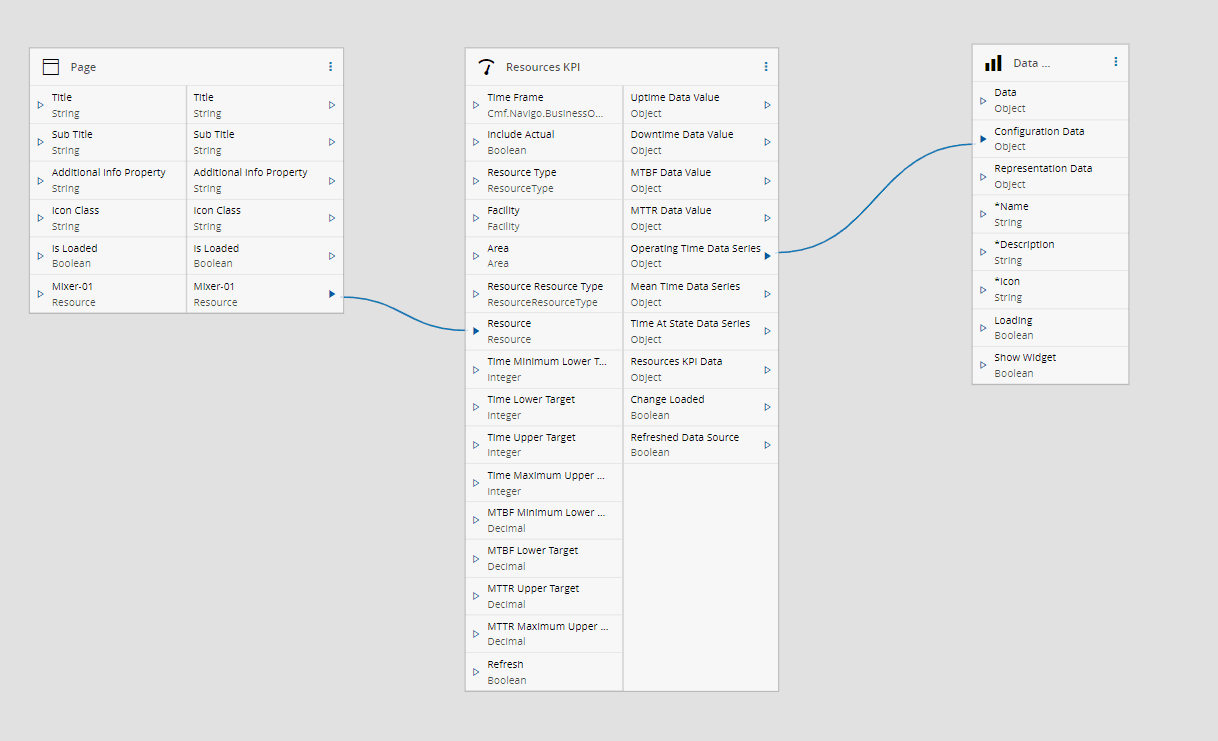
When you are in Edit Mode on a UI page, the Links tab provides access to the Links diagram view, where you can easily connect widgets and tasks. This mode also allows you to quickly check the necessary inputs and outputs for a given task or widget. Task outputs that can be directly connected with widget inputs are highlighted in blue. For example, the Uptime Data Value output of the [[user-guide-system-tasks-kpi##resource-kpi|Resource KPI]] task can be linked with the Data, Configuration Data, and Representation Data inputs of the [[user-guide-uipage-widgets-data-series]] widget. To connect any output with other non-highlighted inputs of the widget, a converter is required. For more information, see [[user-guide-uipages-converters]].
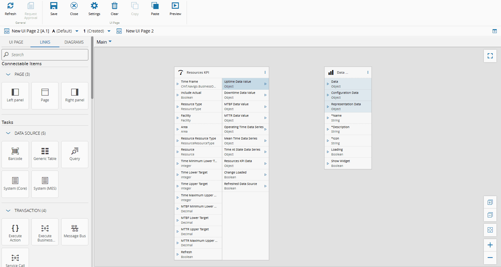
Additionally, you can connect the elements of the page (Page, Left panel, and Right panel) with either tasks or widgets. Similarly, the inputs and outputs that are directly connectable will be highlighted.
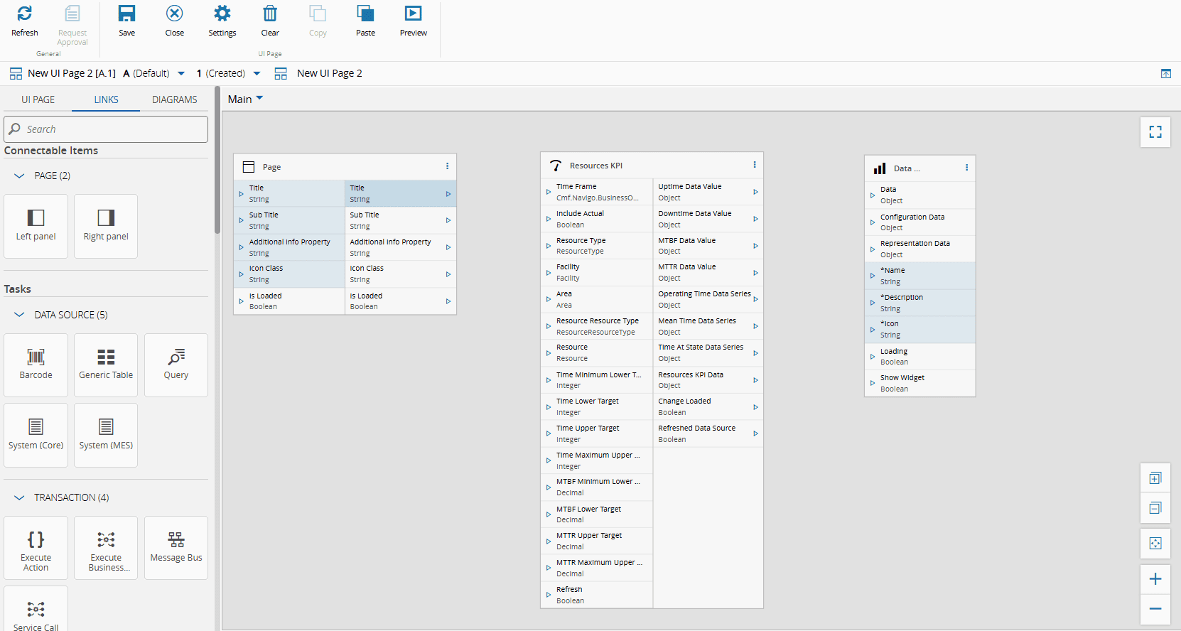
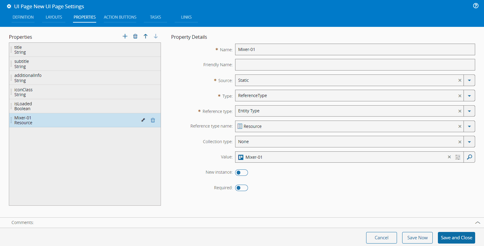
To add additional outputs to any elements of the page, you can use the Properties tab of the UI Page Settings wizard, accessible through the Settings button on the top ribbon. In the example below, an output of Entity Type, specifically a Resource with the value of Mixer-01, is added.
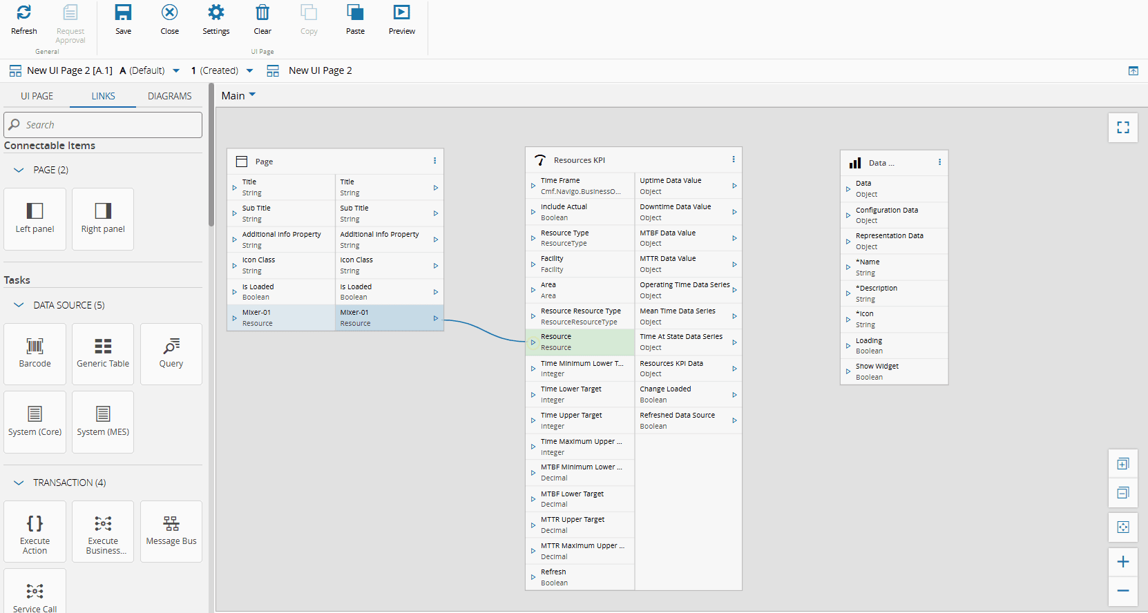
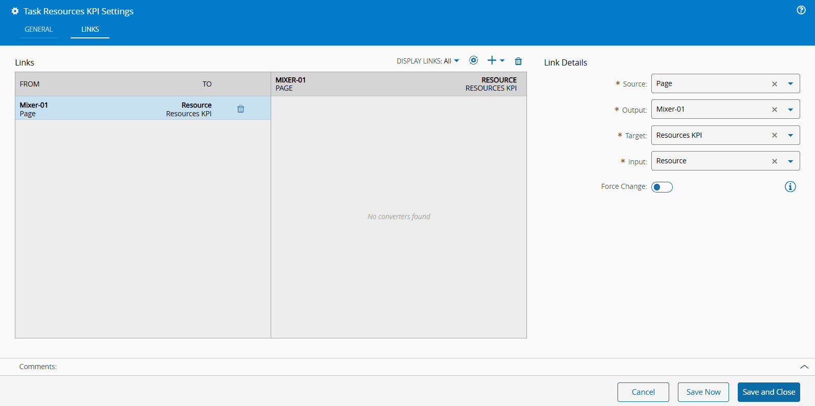
You can then connect the Resource Entity Type, Mixer-01, with the Resource input of the Resources KPI task directly in the Links diagram. Alternatively, you can access the Resources KPI task wizard and use the Links tab to configure the same behavior.
=== "Links Diagram"
=== "Task Wizard"
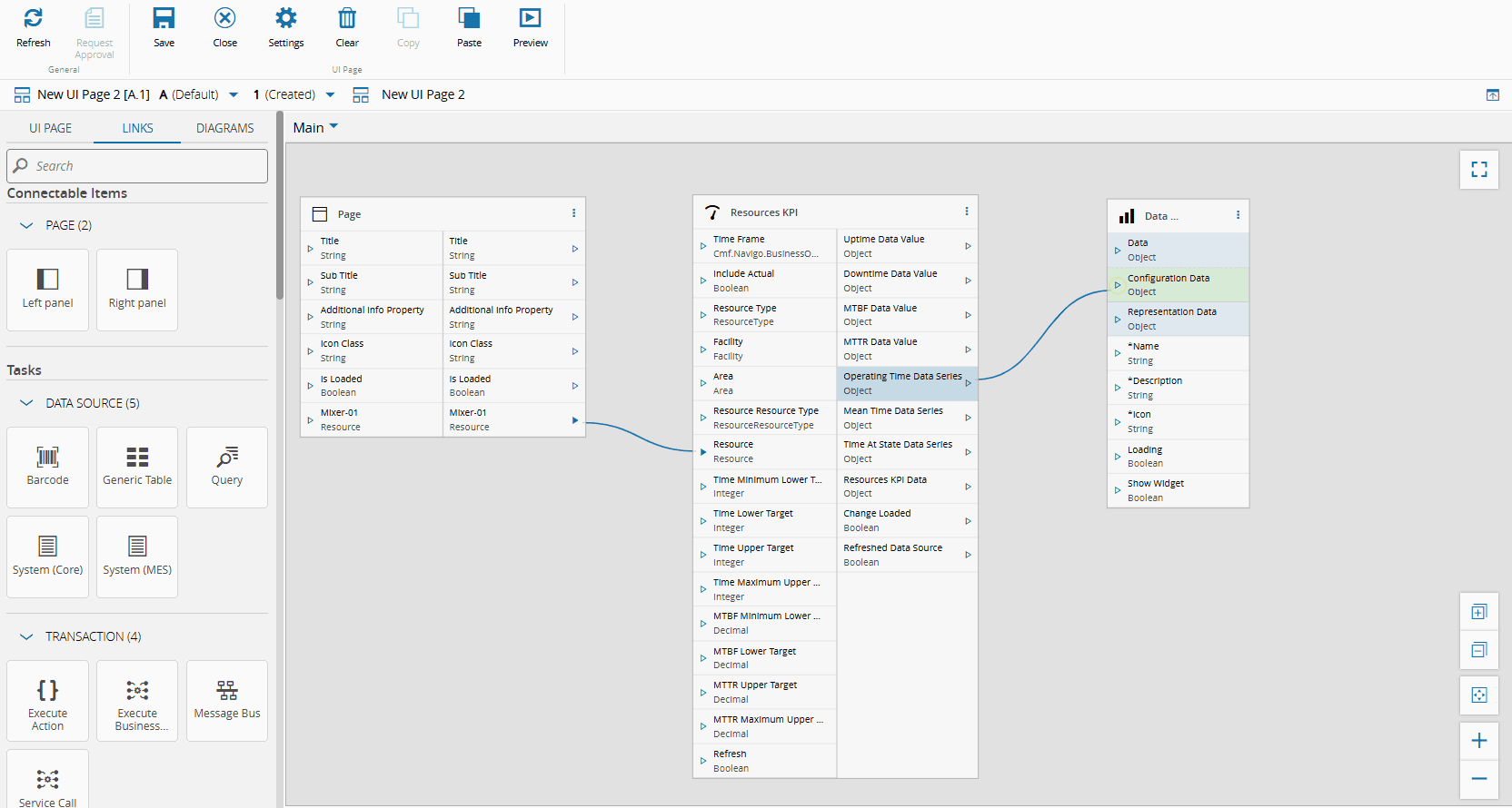
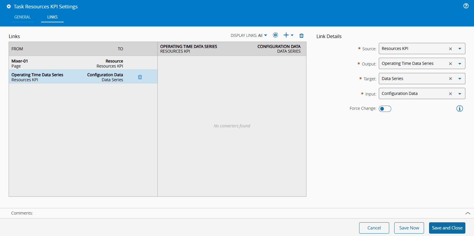
Similarly, you can connect the Operating Time Data Series output of the Resources KPI task with the Configuration Data input of the Data Series widget directly in the Links diagram or through the Settings wizard of the widget or the task, as shown below.
=== "Links Diagram"
=== "Widget Wizard"

=== "Task Wizard"
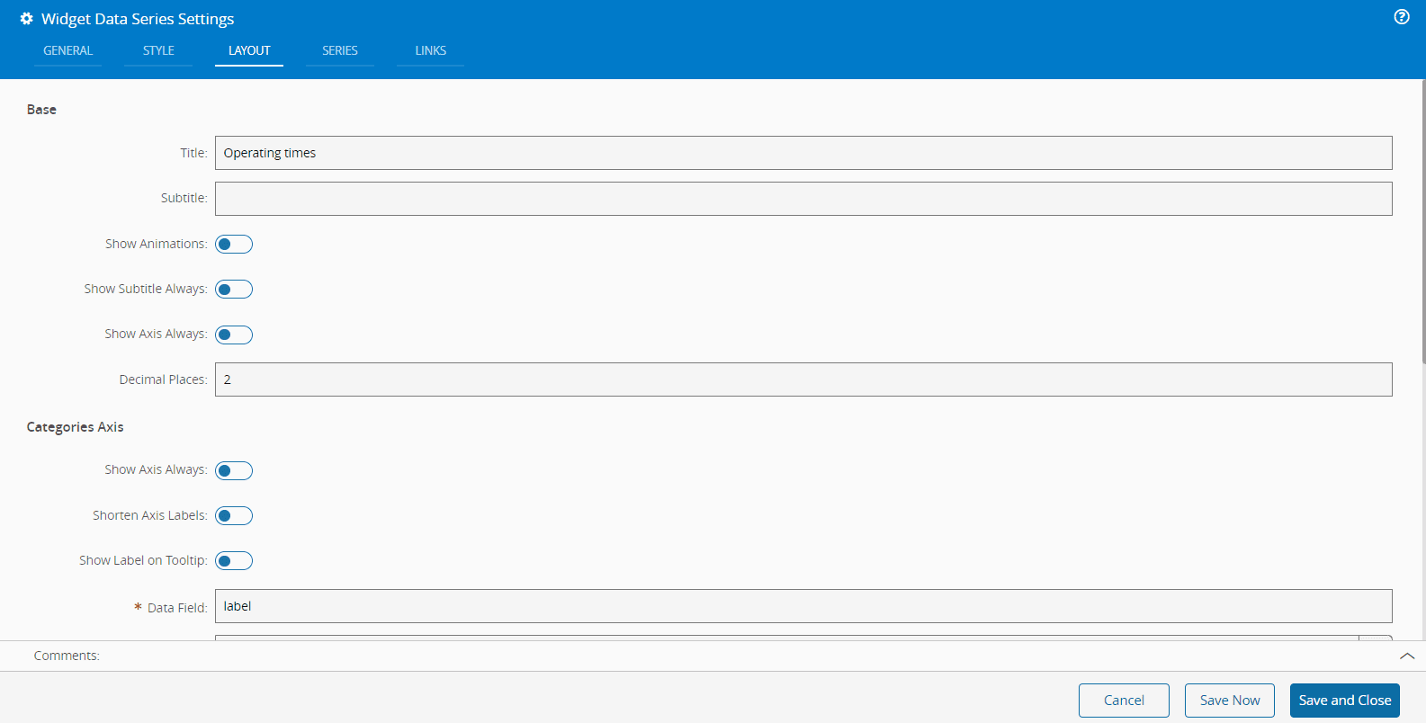
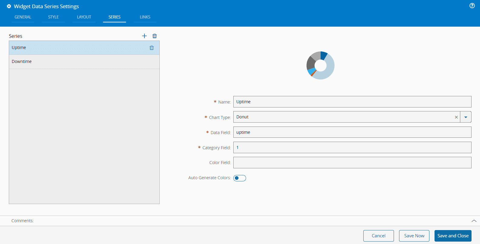
The Data Series widget can be further customized through the Layout and Series tabs in the Settings wizard. For more information, see [[user-guide-uipage-widgets-data-series]] widget.
=== "Layout Settings"
=== "Series Settings"
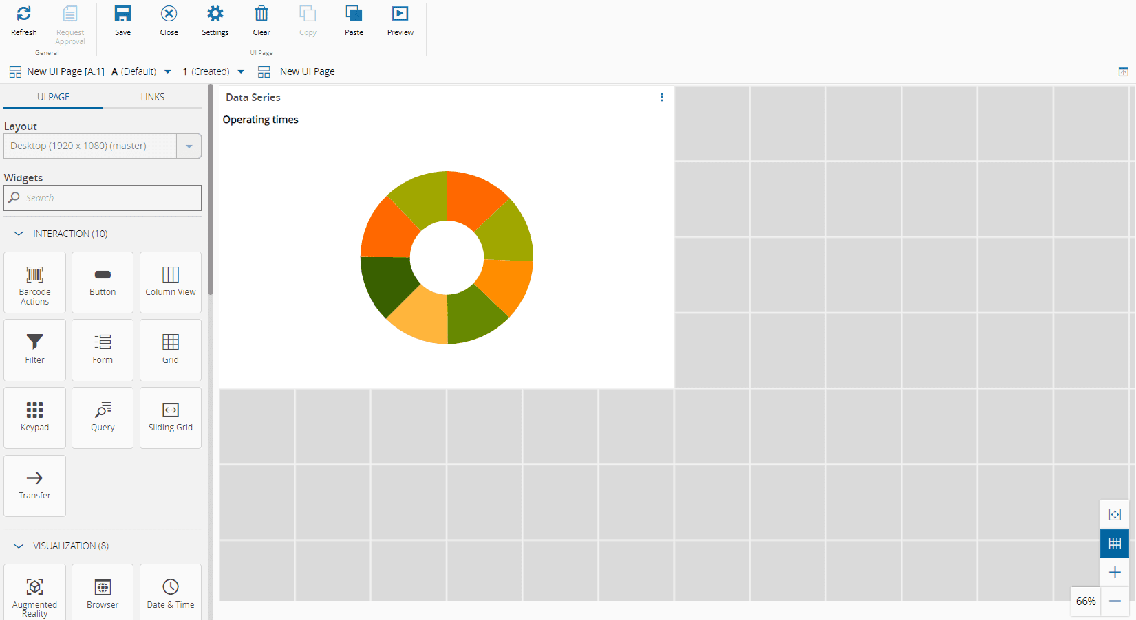
The final result is shown below.
=== "UI Page"
=== "Links Diagram"
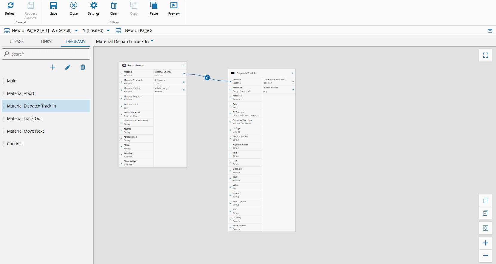
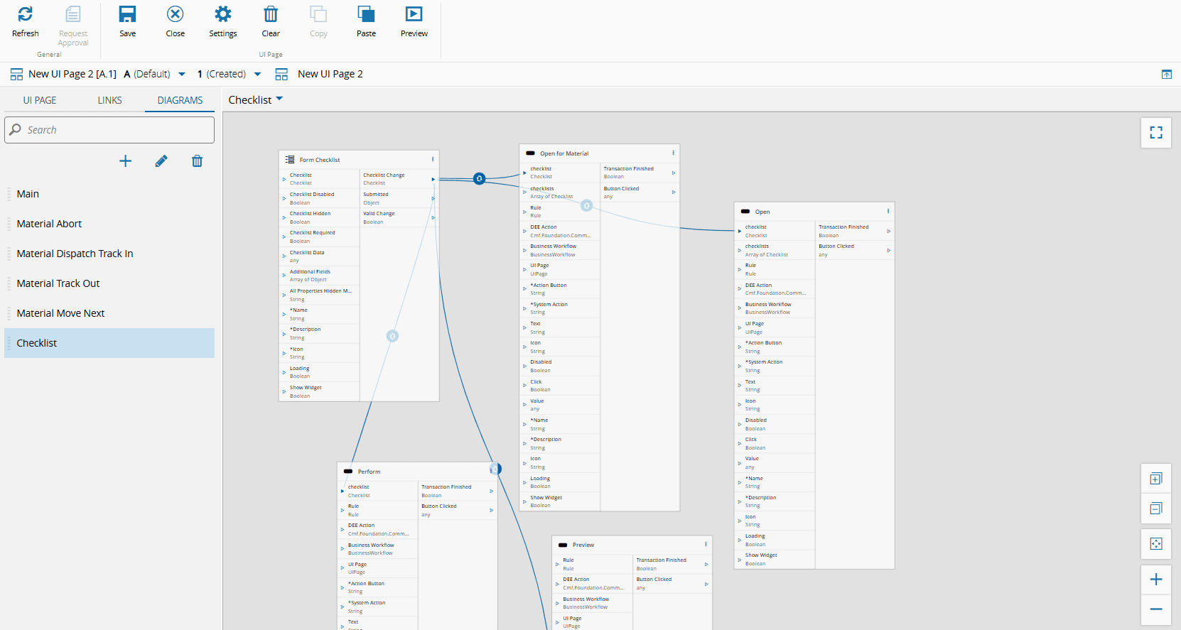
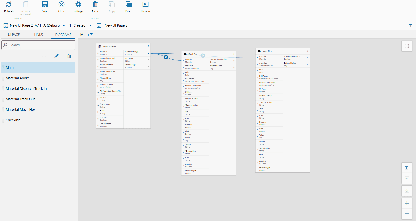
### Using Multiple Diagrams
The Links Diagram view can be overwhelming, specially if you have multiple widgets connected in the same UI Page. A perfect example is portrayed in the image below.
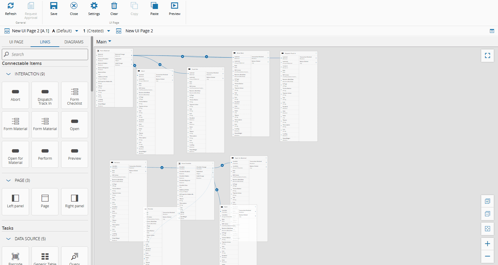
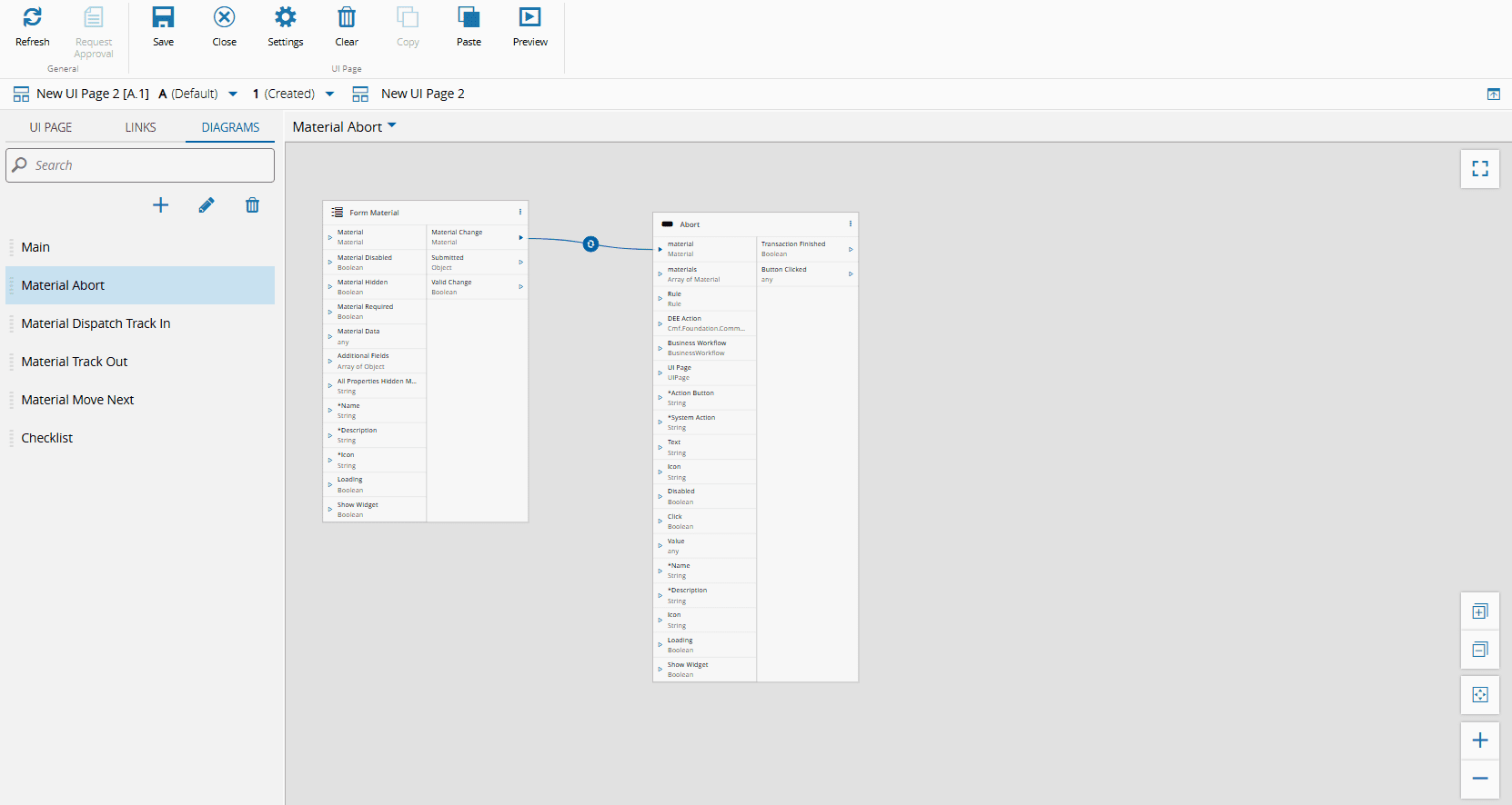
Instead of having everything condensed in one single view, you can define multiple Links Diagrams per UI Page. For that simply select the Diagrams tab in the left panel, and use the :material-plus:, :material-pencil:, and :material-trash-can: to add, edit, or remove Diagrams, respectively. You can also reorder the Diagrams using the drag and drop functionality.
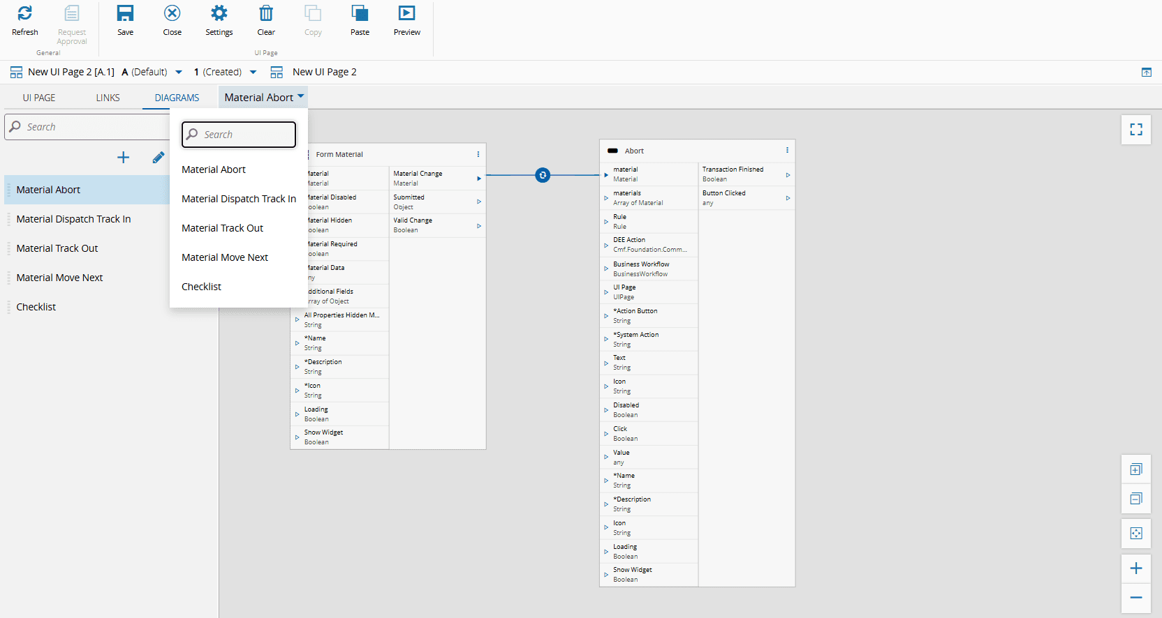
In each Diagram, you can have different items with different configurations, as exemplified by the images below.
=== "Material Abort"
=== "Material Dispatch Track In"
=== "Checklist"
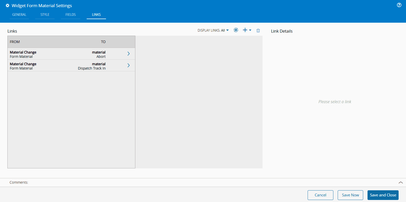
If you create links using the settings wizards, the links will appear in the first Diagram:
=== "Settings: Before"
=== "Diagram: Before"
=== "Settings: After"
=== "Diagram: After"
## Copy and Paste
When editing a UI Page, you can copy and paste Widgets, Tasks, and Action Buttons. Ensure that your browser has permission to use the system clipboard, enabling you to copy and paste UI Page items to another UI Page in a different tab or browser window.
By default, the Copy button is disabled. To enable it, select any item on the UI Page. To select a Widget or a Task, select the area that allows the item to be dragged. Action Buttons are selected by clicking on the top area of the button, where the mouse pointer changes to the default pointer. The Paste button is always enabled and allows you to paste any item onto the desired UI Page. You can also use the usual shortcuts: Ctrl+C and Ctrl+V.
To select multiple UI Page items, press the Ctrl key while selecting the desired items. When correctly selected, the items will display a blue border as exemplified by the image below.
The relative positioning of the copied grid items is retained when pasting. If you place the mouse cursor outside of the grid when pasting, the copied items will be pasted in the first available location in the grid. If you place the mouse cursor over a grid cell when pasting, the item in the upper left corner of the copied items will be placed on the cell the cursor is on.
The copy and paste functionality also applies to the Links tab. If any two widgets in the selection have a direct link or multiple direct links between them, the links will be copied implicitly, including any converters in the link.
!!! warning
It is not possible to select an item from the UI Page Grid and an item from the Links Diagram simultaneously. If items from both the Grid and Links Diagram are selected, only the ones in the currently visible tab will be copied.
It is not possible to copy tasks implicitly. Links to and from Tasks will not be copied unless the task is selected. This means that it is not possible to copy tasks by selecting widgets in the UI Page Grid. A warning will appear if this situation is detected.
UI Pages have master and non-master layouts. You can paste items between layouts within the same UI Page, whether they are master or non-master. This works like dragging an item from the left panel, but you can only paste a widget into a non-master layout once. However, you cannot paste items from a layout in one UI Page into a non-master layout in a different UI Page.
### Using Multiple Diagrams
When working with multiple Diagrams and using the Copy and Paste functionality within the UI Page Grid, the behavior of the pasted items depends on whether or not they have an existing representation in the Links Diagrams:
```mermaid
flowchart TD
A{Are copied items
already present
in a Links Diagram?}
B[Add items
to the same
Links Diagram]
C[Add items to
the first available
Links Diagram]
A -- Yes --> B
A -- No --> C
classDef mermaid_businessdata color:#000, fill:#65CDE8, stroke:#65CDE8, stroke-width:0px, font-size:100%;
classDef mermaid_entitylinked color:#000, fill:#FCD5B5, stroke:#FCD5B5, stroke-width:0px, font-size:100%;
class A mermaid_businessdata
class B,C mermaid_entitylinked
```
!!! info
To paste items into a specific Links Diagram, use the Copy & Paste functionality directly within that Diagram.
## Enabling Smart Barcode Scanning
[[smart-barcode-scanning]] can be enabled on select UI widgets, allowing barcode input to automatically populate corresponding fields. The supported widgets include the [[user-guide-uipage-widgets-filter]], [[user-guide-uipage-widgets-form]], [[user-guide-uipage-widgets-grid]], and [[user-guide-uipage-widgets-sliding-grid]].
Each of these widgets supports the configuration of a Barcode Field Name, which should match the Target Field defined in the [[labelspecificationfield-gt]] Generic Table. Additionally, for the [[user-guide-uipage-widgets-grid]] and [[user-guide-uipage-widgets-sliding-grid]], you can also configure a Barcode Field Value Path to define how the scanned value should be matched within each row.
!!! info
For more information, see the [[user-guide-uipage-widgets-form#barcode-real-use-case]] and the [[user-guide-uipage-widgets-sliding-grid#barcode-real-use-case]] UI Widgets.
## Deploying UI Pages
To deploy **UI Pages** refer to the section [[operation-guide-copyingsystemconfigurations]] of the Operations Guide, which describes how to copy configurations from one system to another.